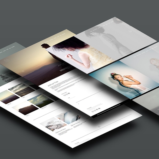
Airdura
Our newest theme is all about simple elegance. Airdura is designed from the ground up to let your imagery shine, featuring full-screen hero images, edge-to-edge blocks and minimalist thumbnail layouts.
We've gone for an immersive and slick look with uncomplicated customisation that keeps your personalisation options simple. The theme's gorgeous typographic styling uses title and summary text over the top of cover images.
Featuring the most blog layouts of any of our themes so far, Airdrura boasts more than twenty layouts to make each portfolio truly individual. Choose from thumbnail or block layouts to create a fully consistent website, or differentiate project and blog styles to create distinct sections.
Airdura is the first theme to include our new Strip layout. With Strip all media in your project is displayed horizontally in one row, using the full height of your browser. Media slides from right to left as your viewers navigate through your project media with the next button, focusing on one item at a time. Strip is a great layout choice for photographic projects that have media primarily comprised of portrait or square images. See Strip in action here.
Theme settings toggle tags, summaries and titles, share icons and a solid colour header. Suited to photographers, designers, artists or creatives with medium-sized portfolios.
For a more in-depth look visit our Airdura showcase site or go straight to our Airdura theme page to get started with this theme.


