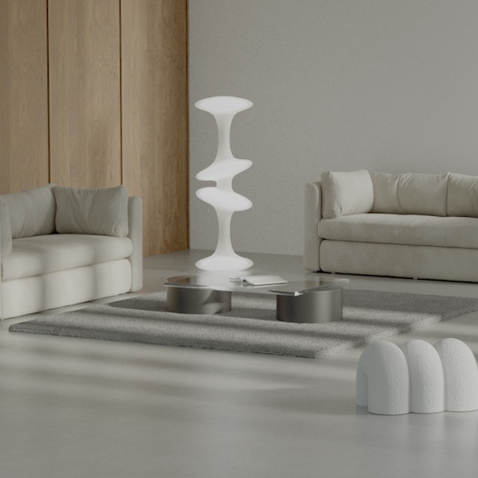
Minimalist Portfolio Website Design
Minimalist design is a design philosophy that focuses on simplicity and clarity. It is characterised by the use of minimal elements, such as simple shapes, clean lines, and a limited colour palette. The goal is to create a clean and uncluttered aesthetic, emphasising the essential aspects of the design and eliminating any unnecessary elements.
We've partnered with Codeless to discuss how the benefits of a minimalist website design can help you showcase your work effectively, provide a positive user experience, and communicate a sense of professionalism and expertise.
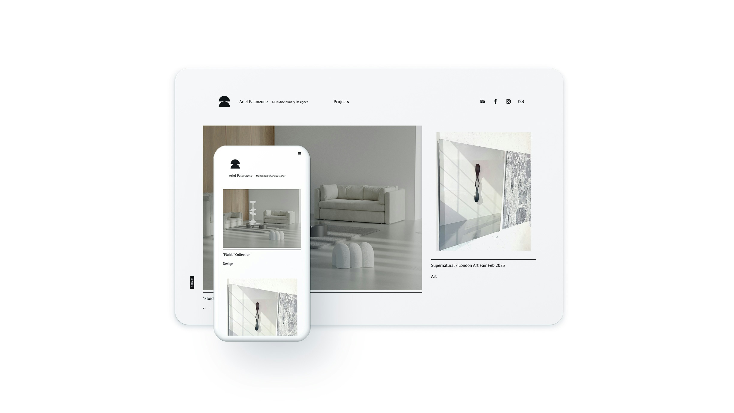
01: Emphasises your work
A minimalist design puts your work front and centre, by avoiding clutter and distractions it provides a canvas that allows your portfolio projects to shine. Visitors to your website can focus on the quality and uniqueness of your work without being distracted by unnecessary design elements, leading to a more positive user experience and a greater likelihood of them engaging with your work. By using minimalist design principles, you can create a memorable and impactful portfolio website that effectively showcases your skills and expertise.
02: Easy to navigate
As a minimalist portfolio website design has fewer design elements, it is typically easier to navigate, making it simpler for visitors to find the information they are looking for. With a clean and uncluttered design, the essential elements of the website, such as the navigation menu and the portfolio items, are more prominent and easier to access.
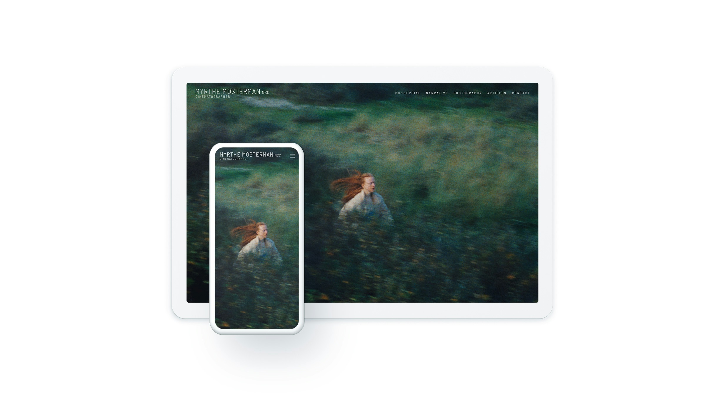
"A well-designed portfolio website should be easy to navigate, fast, and intuitive. People typically visit these websites specifically to view the showcase of work, which means that the centre of attention should be precisely on the featured projects. A minimalist design approach ensures that visitors are not overwhelmed by clutter or unnecessary distractions, thereby providing a seamless and enjoyable browsing experience." - Eldo Roshi, Codeless
03: Fast loading times
A minimalist portfolio website design can lead to faster loading times because it typically employs a smaller file size due to its simple and streamlined design. With fewer design elements, the website requires less processing power and fewer HTTP requests, resulting in faster loading times. This is important, as slow loading times can negatively impact user experience and lead to higher bounce rates.
04: Mobile Friendly
A minimalist portfolio website is typically designed with responsive design principles in mind. By using a simple and clean layout, a minimalist design lends itself well to adapting to different screen sizes, making it easier to view and navigate on mobile devices.
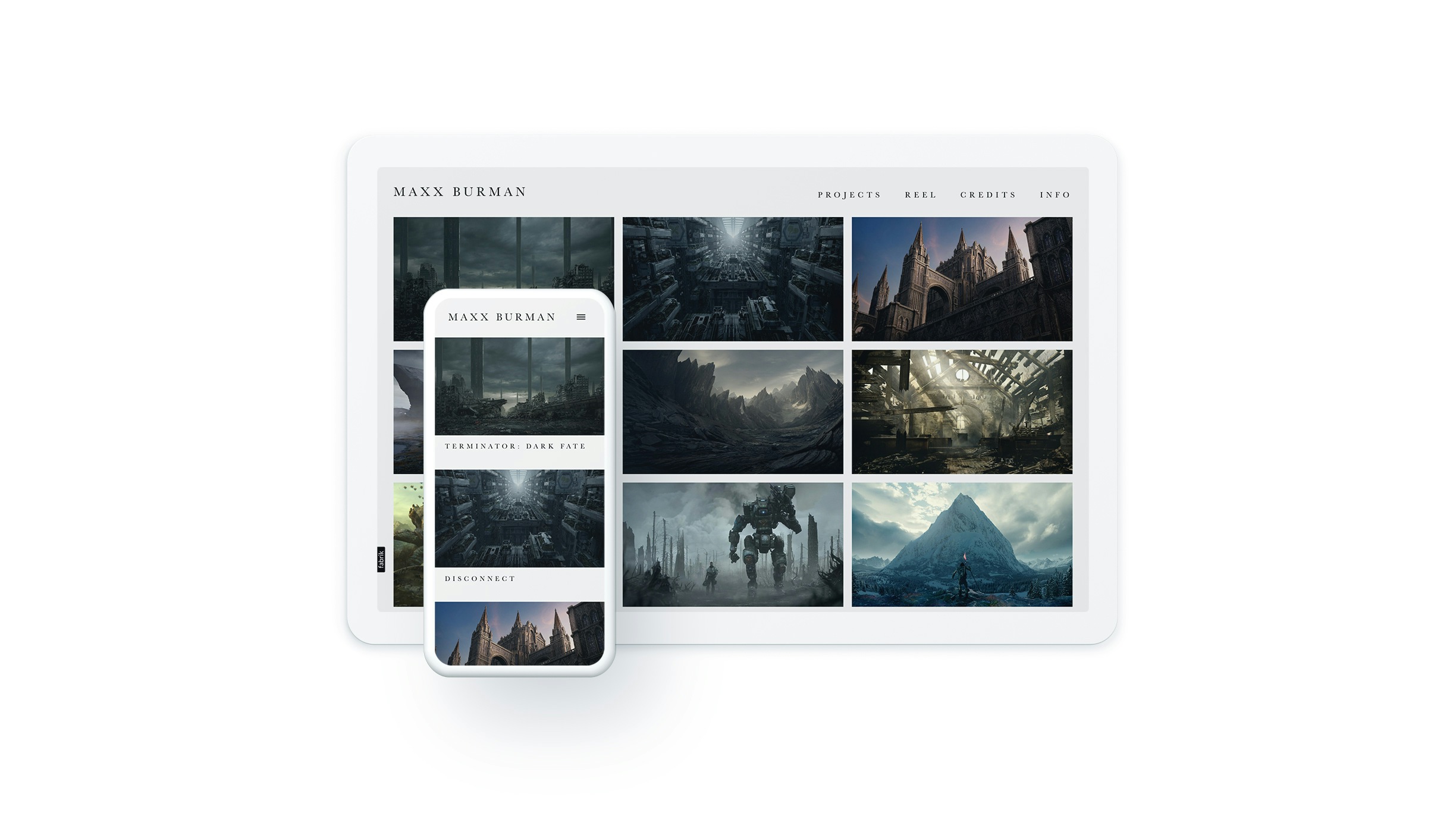
"Minimal design on portfolio websites is essential to highlight the work being showcased and create a positive user experience. By keeping design elements in check and focusing on ease of navigation, we can ensure that our portfolio websites are not only aesthetically pleasing but also effective in presenting our work to potential clients and collaborators." - Eldo Roshi, Codeless
05: Timeless and versatile
A minimalist portfolio website design is timeless and versatile as it relies on simple and classic design elements that transcend trends and fads. The simplicity of the design makes it easy to update and modify as needed. By avoiding complex and trendy design elements, a minimalist design can remain relevant and effective for years to come.
06: Focuses on your content
By prioritising simplicity and clarity in your portfolio website design, you can create a space that effectively showcases your work and encourages visitors to focus on the content, skills and expertise on display, thus leading to greater engagement and more opportunities.
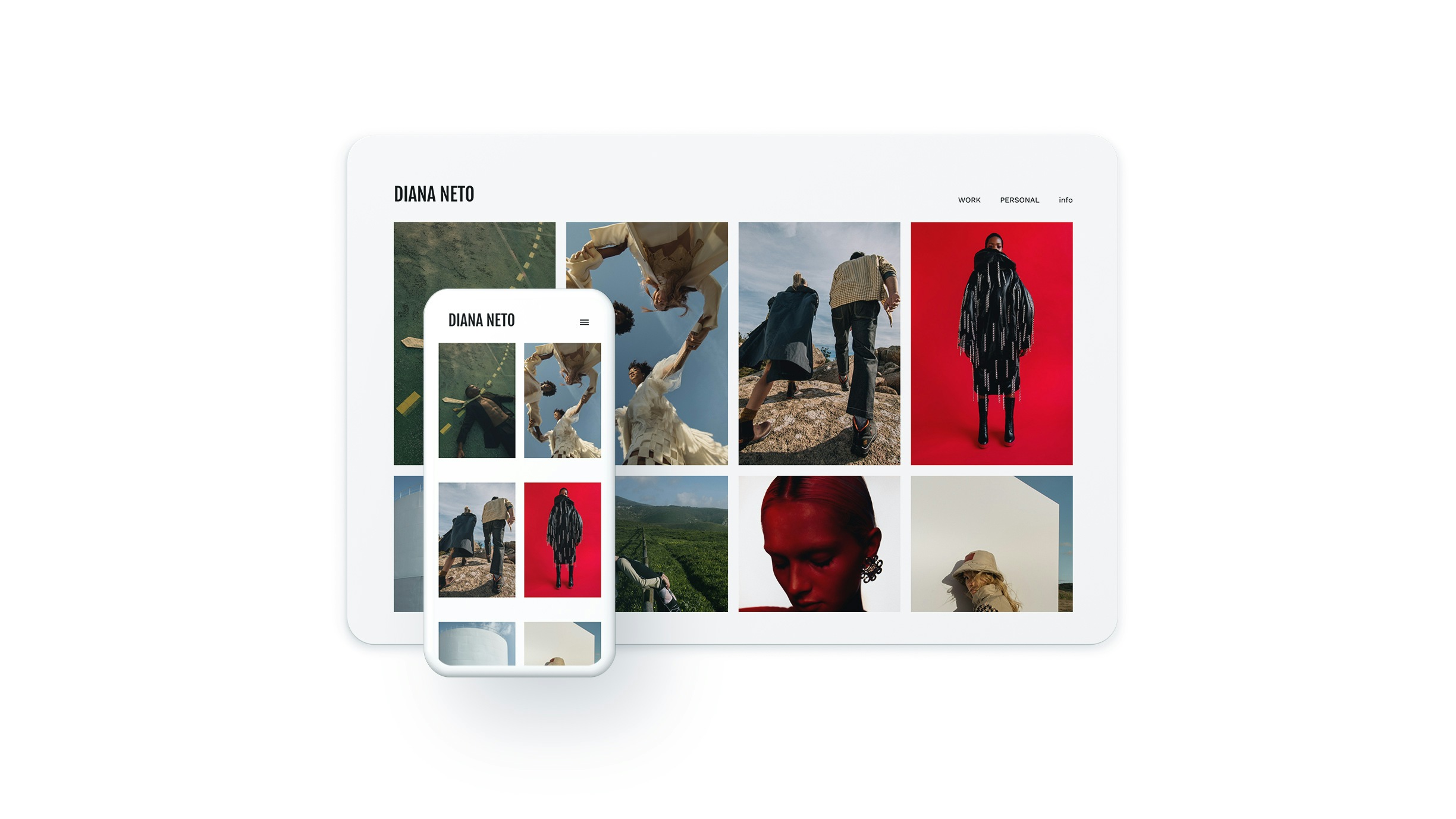
"As a designer, I cannot emphasise enough the importance of minimal design on portfolio websites. Such an approach allows for the focus to be placed on the photographs and portfolio items themselves. It is essential to have a design that includes tasteful design elements, but without going overboard. Striking the perfect balance between style and simplicity can be challenging, but it's a crucial aspect of creating an effective portfolio website." - Eldo Roshi, Codeless
