The Summary: A Deep Dive into 120 Portfolio Websites
We love checking in with our community and discovering the features of Fabrik that are your favourites. Your creative portfolio is an organised collection of creative work showcasing your creativity, your practical abilities and thought process - A visually co-ordinated, fully cohesive curation of creative work packaged like a product and clearly thought out. We take care of the technical stuff and you take care of the content. Simple.
Jump straight to the sections:
Themes
Homepage Layouts
Project Layouts
Image Crop Ratios
Colours
1. Themes
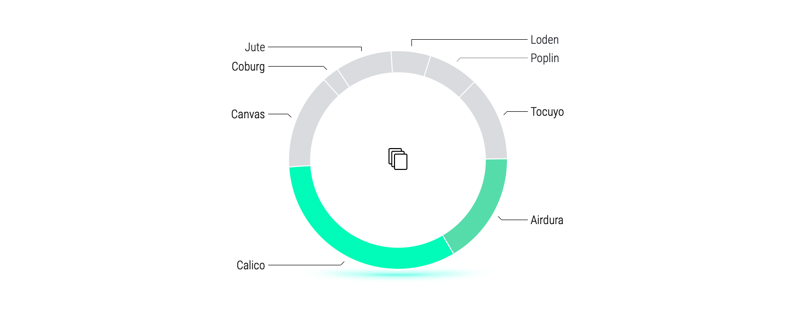
33% of our creators use Calico as their choice of theme and is favoured by 3D, VFX and CGI Artists.
Our themes use intelligent layout technology to adapt to your project content and to make things easy, you can switch your theme at any time. We're often asked by our trial users which theme they should use for their portfolio sites. Ultimately there's no right or wrong theme to use - it's about finding the layouts that show your project content off best.
↑
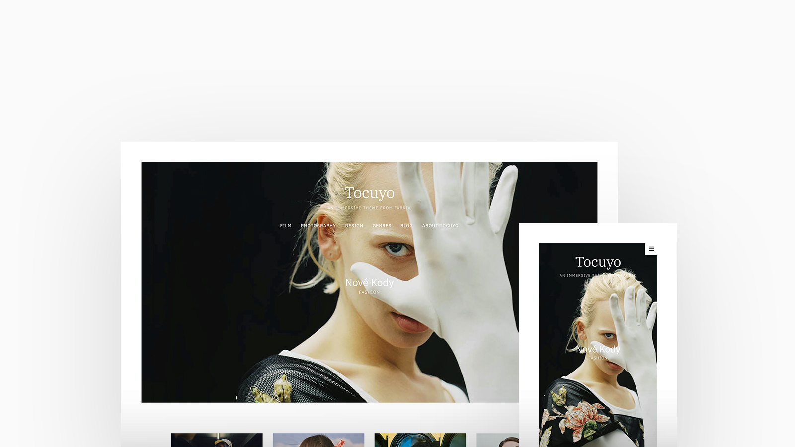
Tocuyo
Particularly popular amongst Artists with over 33% deciding on Tocuyo as their choice of theme. The perfect pick for creatives that want to introduce themselves as well as their work, with optional Cover layouts, Tocuyo becomes truly immersive with a full-screen hero, thumb grids and an inline About content. Suited to medium-sized portfolios.
↑
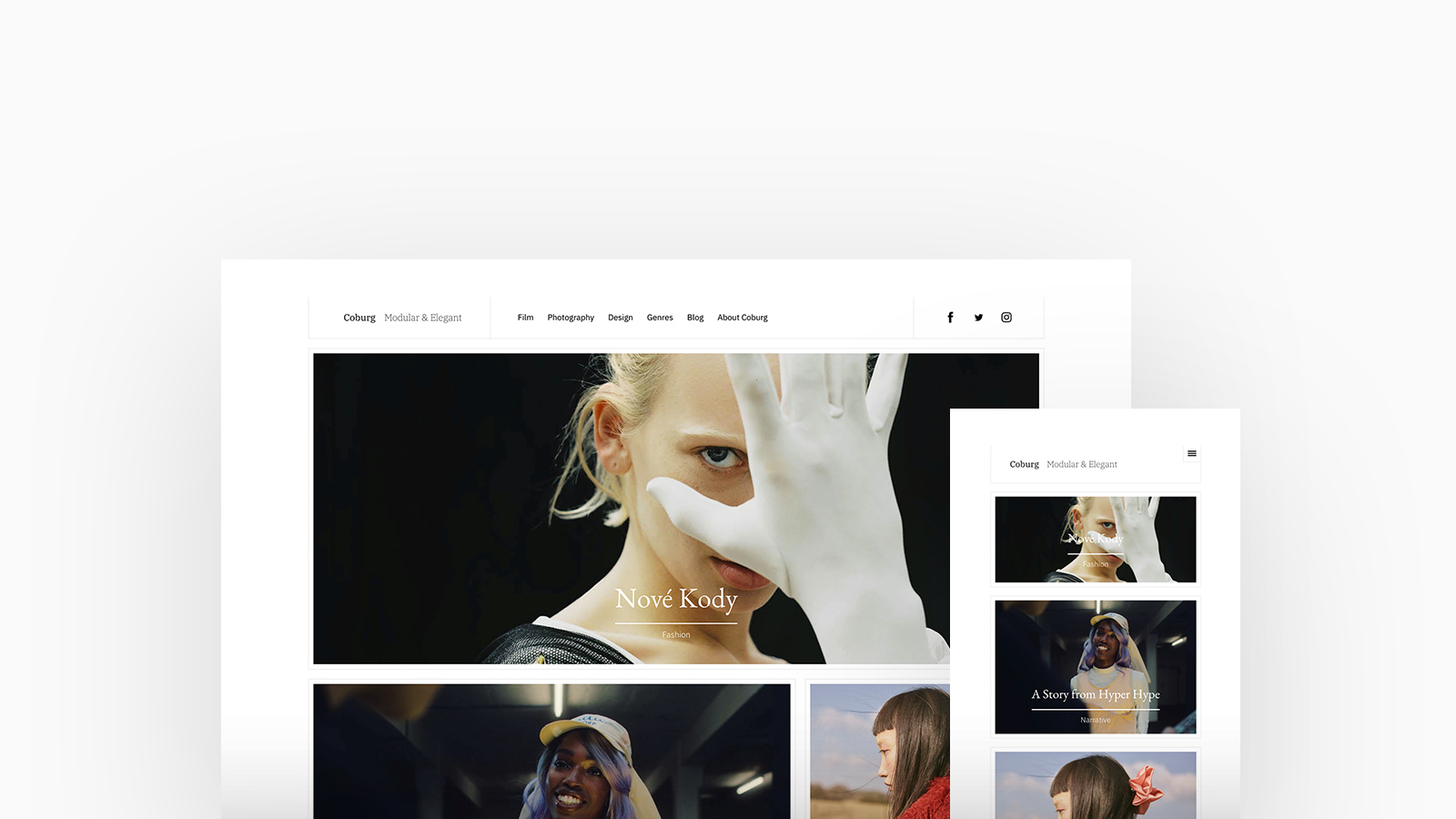
Coburg
A magazine format theme that introduces Fabrik's Scatter layout. 13% of Studios and Agencies choose Coburg for it's beautiful typography and styling frame, your project content is arranged harmoniously with bordered containers.
↑
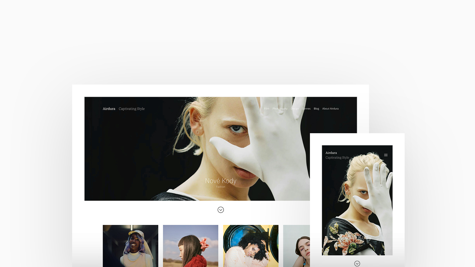
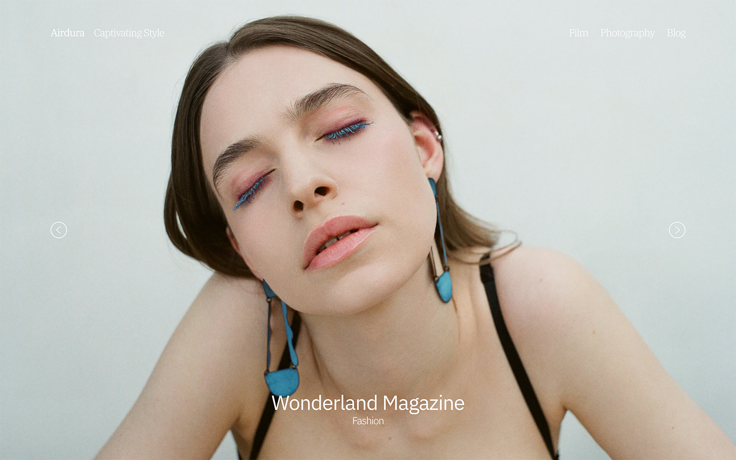
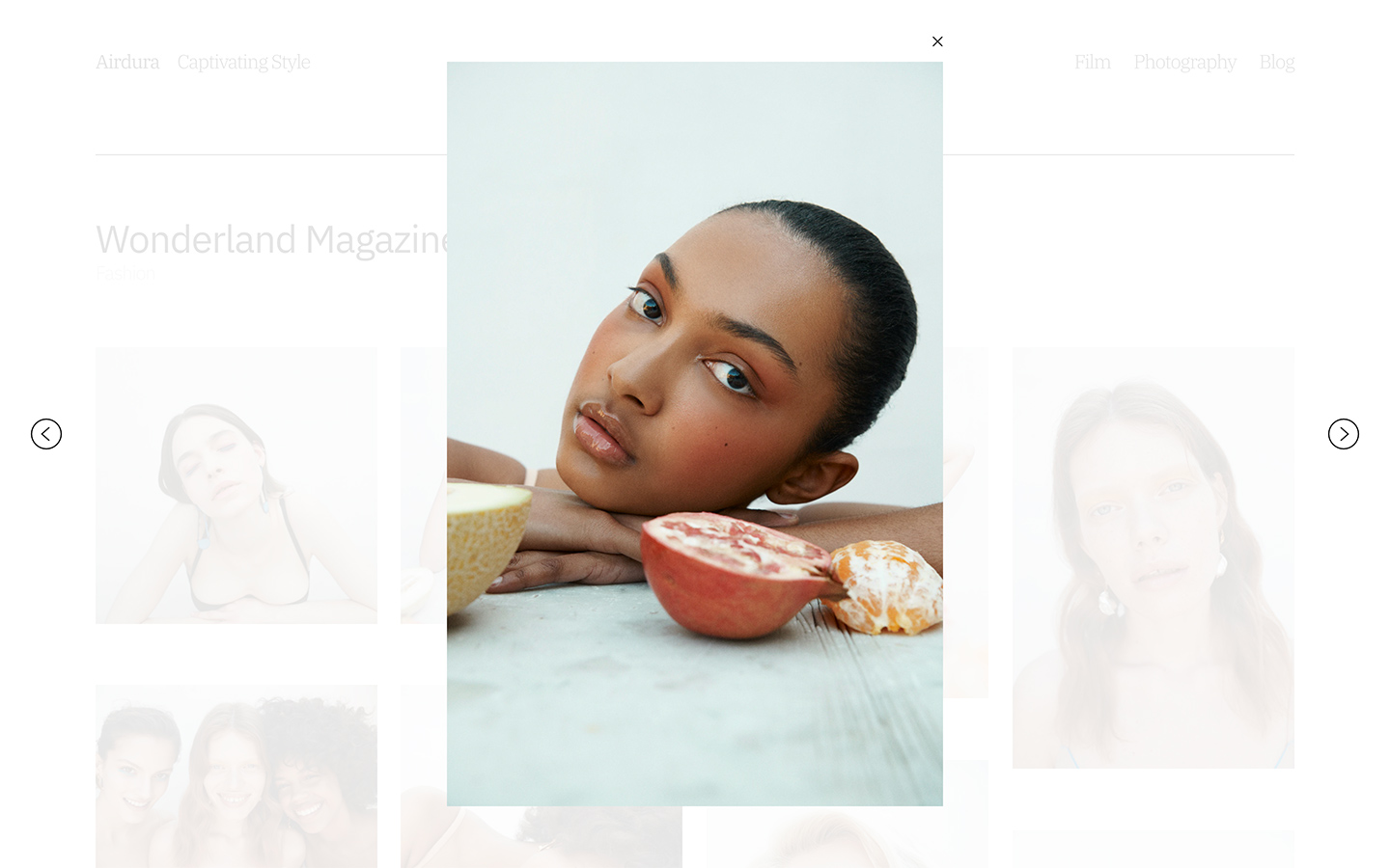
Airdura
An immersive and slick theme that couples gorgeous typography with full-width imagery and unique block styles. With over twenty layouts to play with, 40% of Designers favour Airdura for its ability to showcase a portfolio that is truly individual and present projects perfectly.
↑
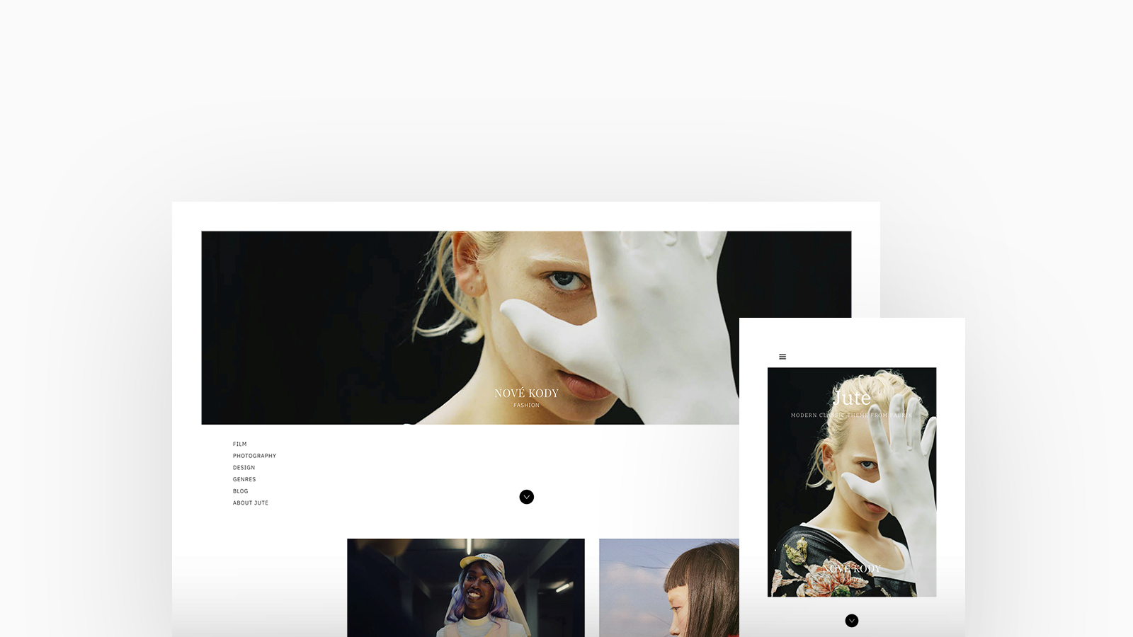
Jute
A distinctive modern theme with classic typography and styling. Full-width cover images, homepage layouts featuring a bottom-aligned menu and a responsive sidebar. Expansive, beautiful imagery is shown off with great layout options - Loved by a collective of creative genres with over 25% of those being Stylists and Filmmakers.
↑
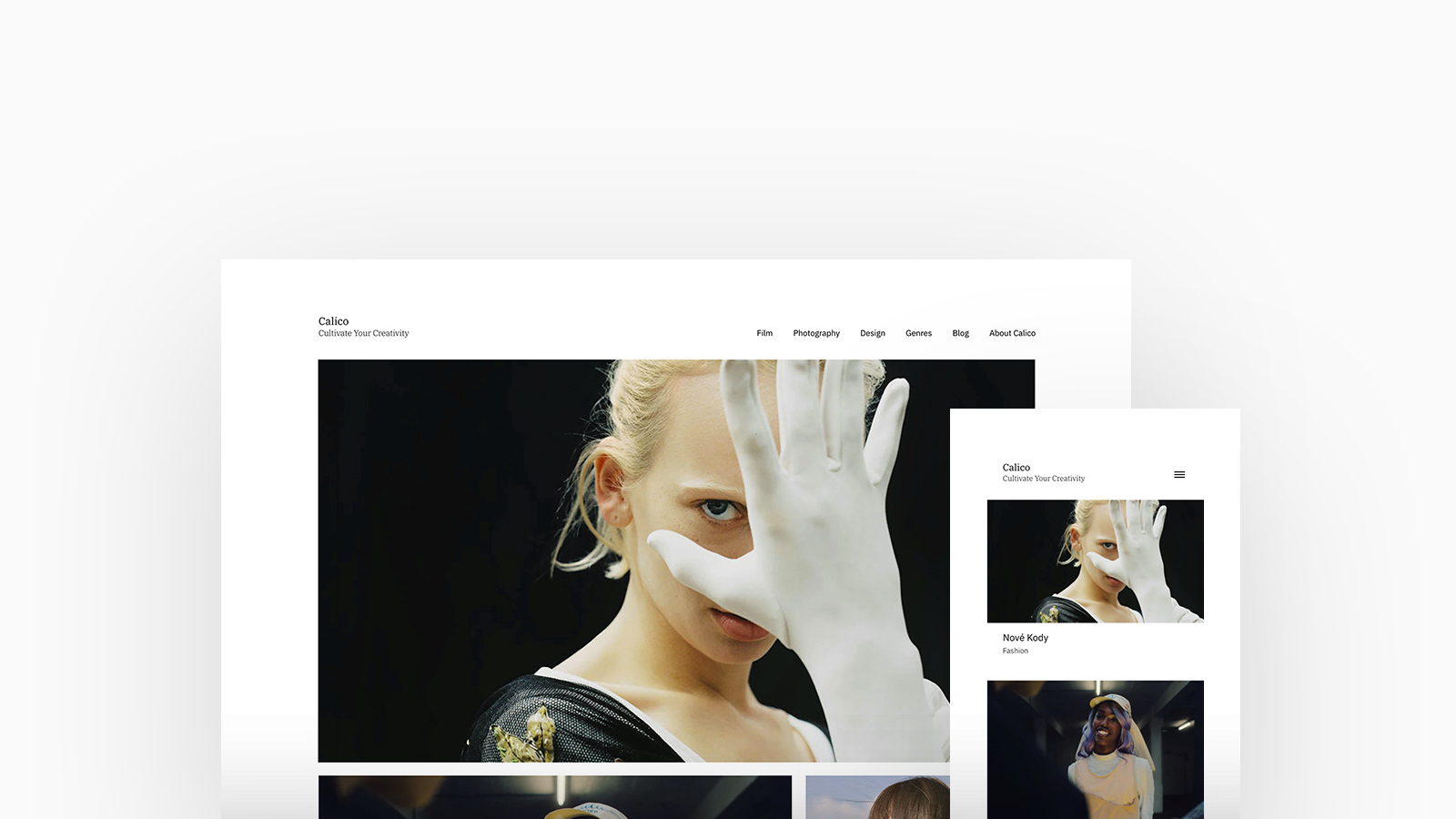
Calico
A magazine format theme with unique homepage layouts and several project layout options geared towards presenting longer-form projects and blog posts. A whopping 66% of 3D, VFX and CGI Artists have chosen Calico as their theme taking full control of it's customisation options.
↑
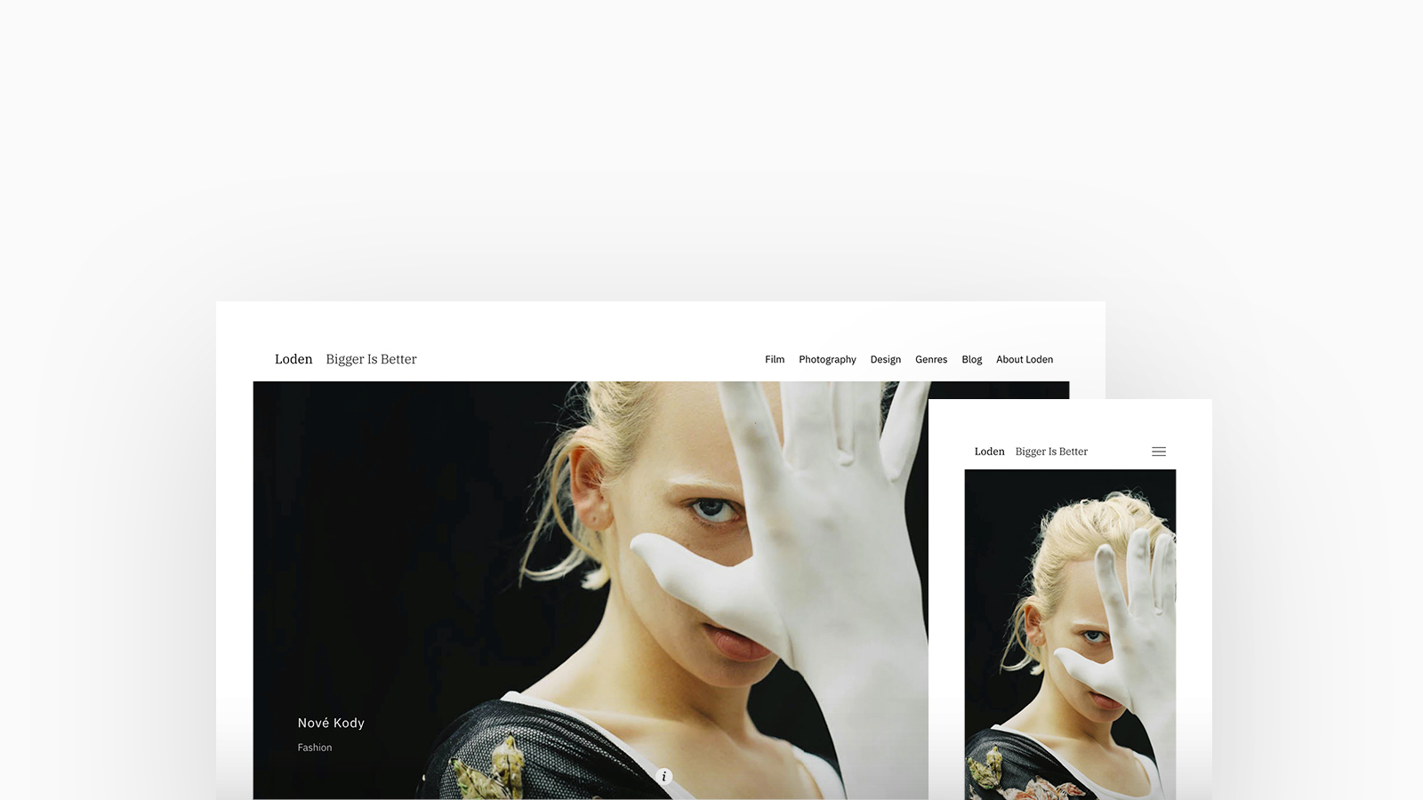
Loden
Bigger is better with Loden; a theme that focuses on making photos and videos as large as possible. Loden is bold, and desired by both Filmmakers and Artists with over 25% letting their imagery and videos do the talking.
↑
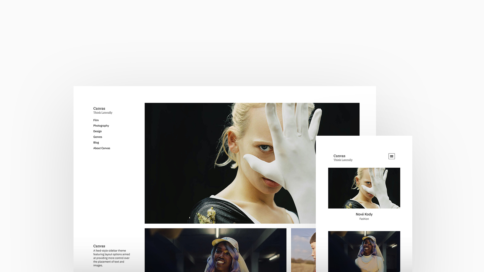
Canvas
A feed-style theme featuring a sidebar and layout options aimed at providing more control over the placement of text and images. A great choice and loved-by over 40% of Photographers for it's ability to allow images to be displayed in both un-cropped or portrait formats.
↑
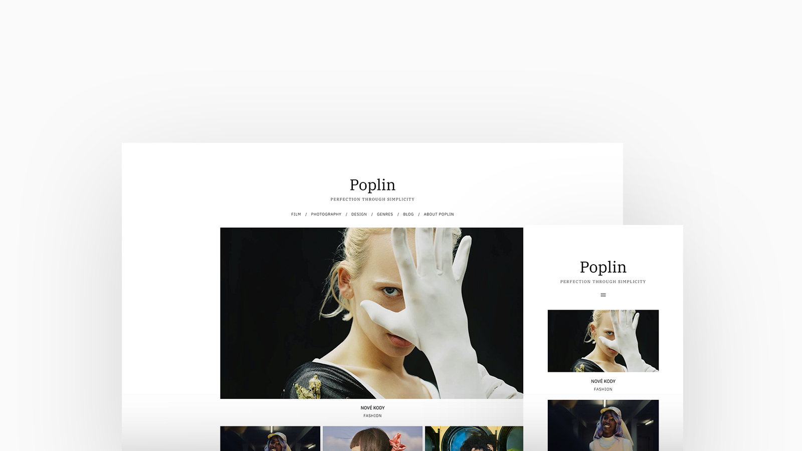
Poplin
An incredibly versatile and straightforward theme favoured by over 20% of Studios and Agencies featuring lots of layout options to help you to find a unique style for your website. With a focus on simple thumbnail grid layouts, creatives with lots of projects will find this theme useful.
2. Homepage Layouts
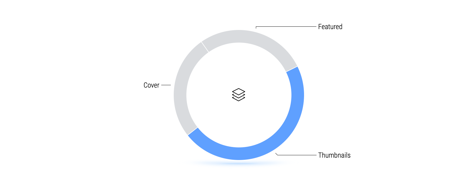
Almost half of our Fabrik community prefer to show Thumbnails on their homepage rather than introduce themselves with highlighted work.
Seemingly popular with Photographers, a thumbnail layout is a great choice if you want your audience to focus on a single media item at a time, making it a useful layout for viewing video and imagery with a lot of detail. It is an adaptable layout suitable for the majority of creators who have varied media types and aspect ratios.
↑
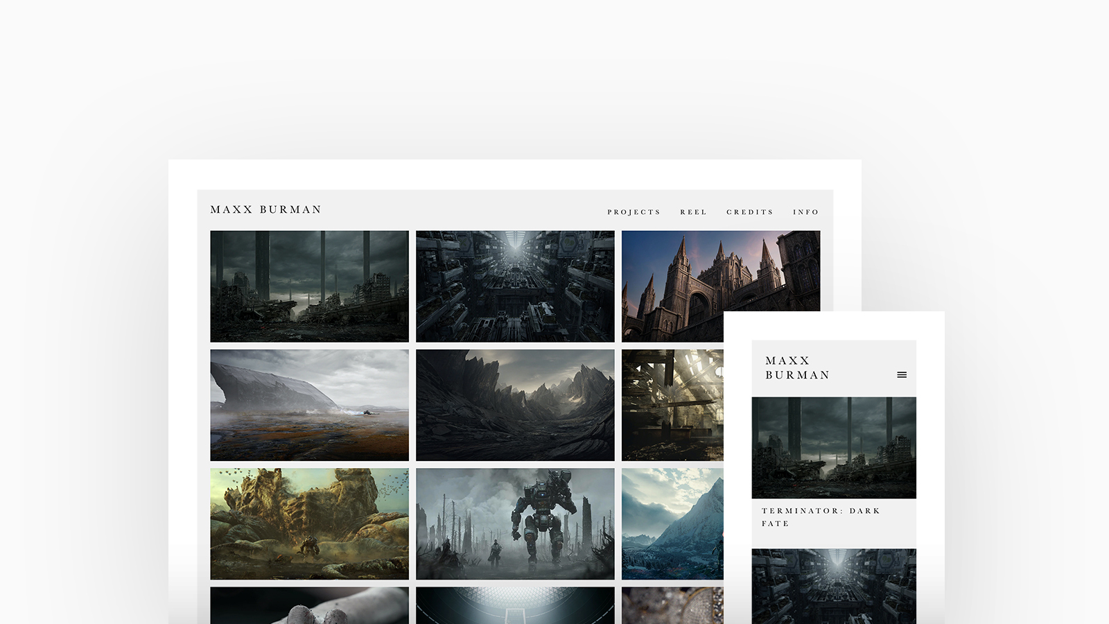
Maxx Burman Matte Painter and Art Director. Theme: Calico, Homepage Layout: Thumbnails
↑
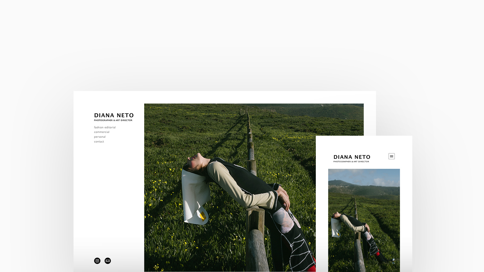
Diana Neto Art Director. Theme: Canvas, Homepage Layout: Cover
3. Project Layouts
Layouts are designed to give your project the flexibility it needs to allow you to present it to its fullest.
All of our themes include layouts. Each layout is designed with specific media aspect ratios or presentation modes in mind, so whether your imagery is formatted to portrait or landscape, or you want to feature video and imagery in unique ways, there will be a layout option that works best for each of your projects.
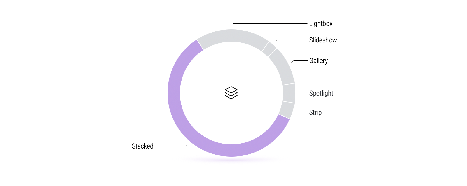
 | Stacked Stacked is a very simple and forgiving layout that allows for variety in the types and sizes of media you have. Choose a stacked view if your project comprises media of varying aspect ratios or if you’re looking for a view that looks like a feed. A great layout if you want to present your project as a case study or a journey. |
A top-pick for Designers, our Stacked layout is perfect for case studies or a variety of media formats and accounts for almost two thirds of all project layouts.
Gallery Gallery uses a fixed aspect ratio and may crop your media to fit the frame so this layout is especially suited to projects where all the media has very similar aspect ratios. A good choice for photography and film projects created from a single shoot or that are shot with a specific theme in mind. | 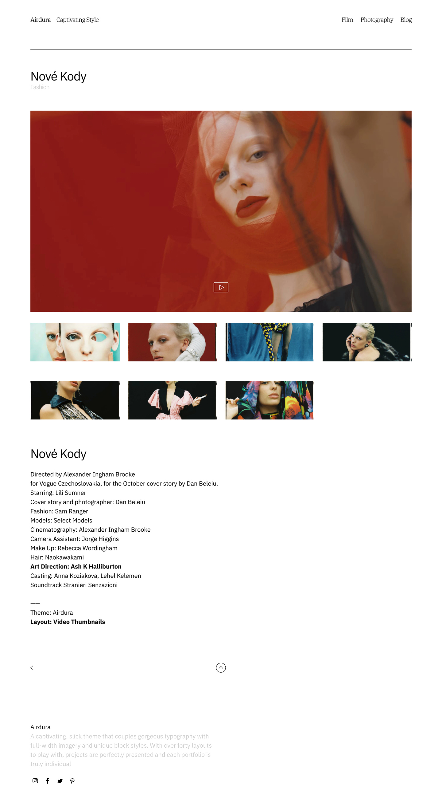 |
 | Slideshow Slideshow suits projects where all of the media has very similar aspect ratios and can be useful if you need to collect together a portfolio of unrelated work or if you want your viewer to see your project in a set sequence. |
Spotlight If you are looking to highlight specific projects from your portfolios, or important media within a project, without looking overcrowded or busy, then this is the layout for you! For each row, spotlight's width and height are balanced with a simple mathematical formula - so you may find that your smaller media items are slightly cropped to make sure that the height of the two thumbnails fits perfectly to the height of the larger thumbnail. |  |
 | Lightbox Lightboxes are a great choice if you want your audience to focus on a single media item at a time, making it a useful layout for viewing video and imagery with a lot of detail. This layout is versatile and suits projects that have varied media types and aspect ratios. |
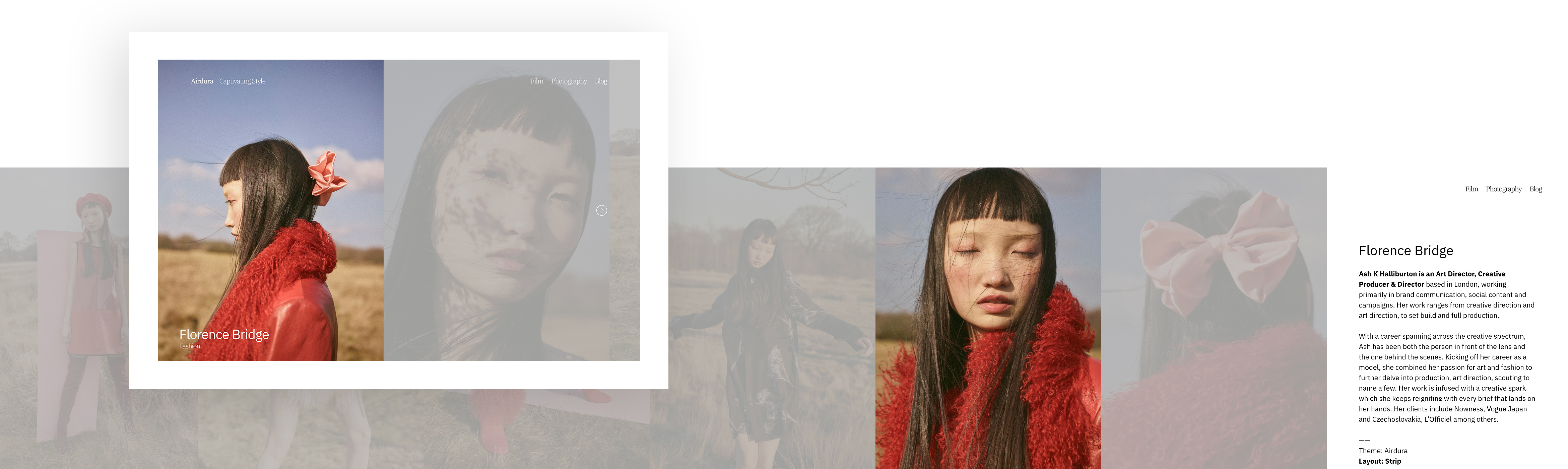
Strip
All media in your project is displayed horizontally in one row, using the full height of your browser. Media slides from right to left as your viewers navigate through your project media with the next button, focusing on one item at a time. Strip is a great layout choice for photographic projects that have media with varied aspect ratios or projects primarily comprised of portrait or square images.
↑
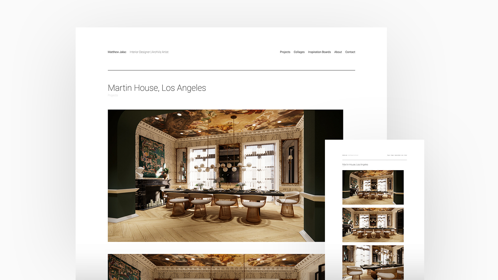
Matthew Jalac Interior Designer. Theme: Airdura, Project Layout: Stacked
4. Image Crop Ratios
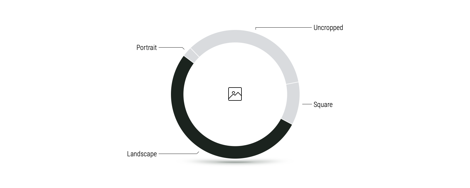
You love a landscape, we love a landscape. With just over 50% of you opting for a landscape ratio on your Fabrik site.
It's safe to say that Filmmakers have a particular fondness for landscape ratios but they aren't alone. A portfolio displayed in landscape is popular with the majority of our creators as it allows them to display an array of projects in different formats, from image stills to video.
Discover how Filmmakers use Fabrik
Unlike other creators, Photographers tend to showcase their images in a range of ratios, but most opt to display their work uncropped so that it can be viewed in all its entirety.
Photographers on Fabrik: A Deep Dive
We believe that 3D, VFX and CGI Artists are torn between a uncropped, square or landscape image crop as they are rarely bound to specific aspect ratios and feel that each project should be showcased to enhance the dimensional aspects of their work.
See 3D, VFX and CGI Artists on Fabrik
As the only creator type that shows all crop groups, Stylists and Models are unique here. Often supplied with images directly from the photographers or reps they work with, Stylists and Models don't often have as much control over how those photos are presented.
How Stylists, MUA's and Models use Fabrik
Artists work in an array of different mediums and the majority opt for an uncropped ratio. This allows them to capture the viewers gage and fully immersive them into the thought process and deeper meaning behind their work along with giving viewers a similar experience to being present within an art gallery.
How Artists build coherency across disparate works
Studios and Agencies work closely alongside a vast majority of creatives within different fields and showcasing their portfolio in landscape allows them to display an array of projects from image stills to video.
Studios and Agencies on Fabrik
↑
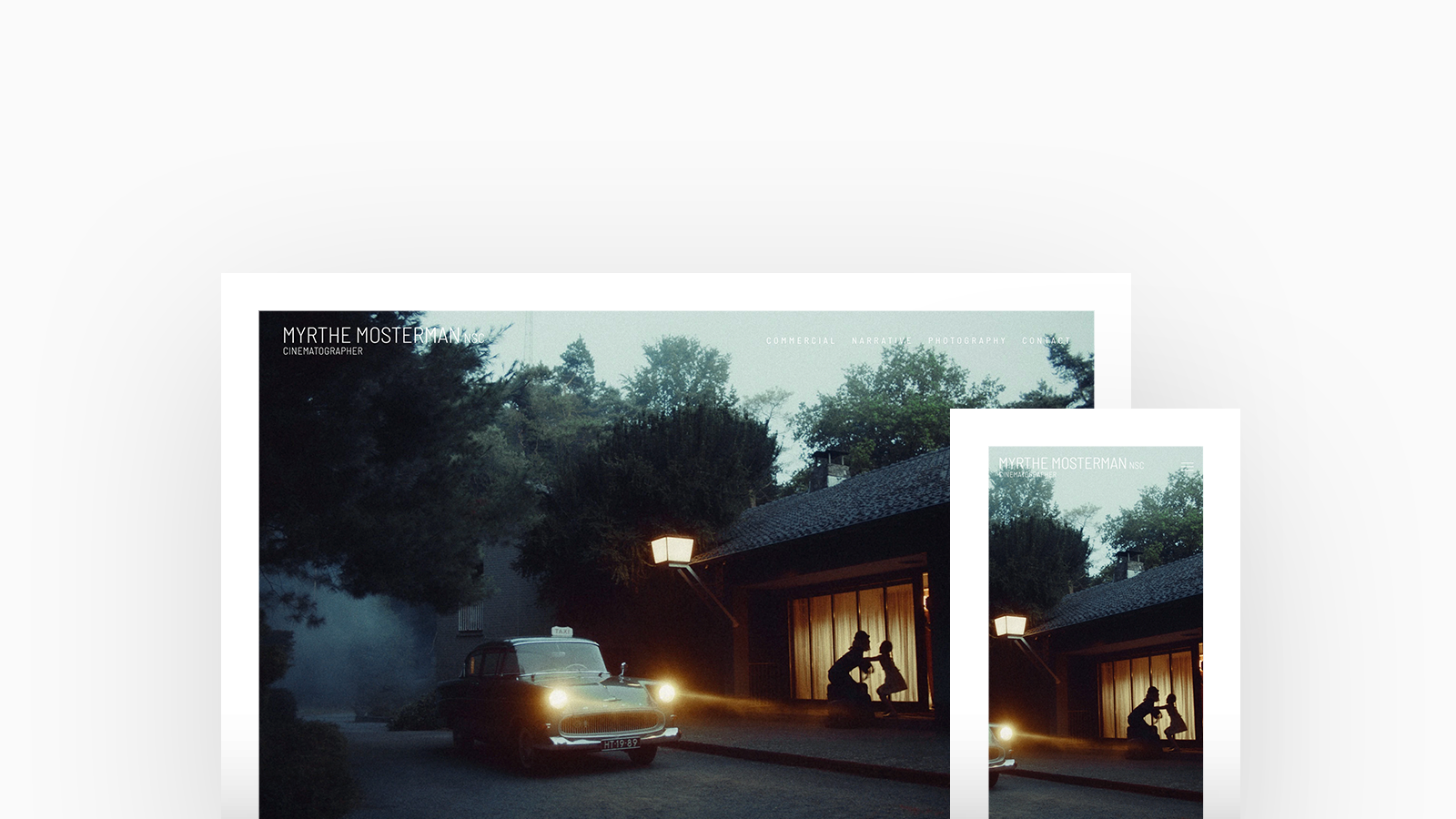
Myrthe Mosterman Cinematographer. Theme: Loden, Image Ratio: Landscape
5. Colours
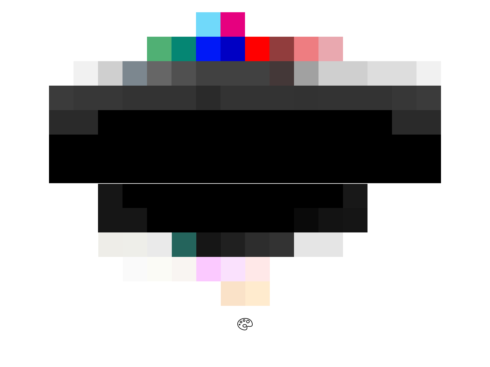
Simple is best. The majority of our creators opt for a clean-cut white background with black text.
However, not all of our community feel the same way. Imagery or video content displayed on a dark site helps accentuate texture and tone and a pop over color adds a touch of personality. A darker background is usually paired with white or light grey text to give a complimenting contrast.
3D, VFX and CGI Artists favour a black background with light text to make their projects stand-out from the crowd whereas Studios and Agencies love a pop of personality and were found to be the creators that showcased the most amount of colour.
Our deep dive into 3D and VFX Artists on Fabrik
We saw illustrators display work with closer colour tones and swatches. This is no doubt purposeful on the part of the illustrator - working with palettes they're comfortable with, and working within colour trends over time. A straightforward white background and black text remains popular, but again, with close colour palettes there are opportunities to use more unique background colours that compliment flat artwork.
See our findings for Illustrators on Fabrik
Artists often leave the colors and tone within their artwork to influence their portfolio and opt for a simple white background with black or grey text. Some Artists only use specific colors within their palette so may choose to incorporate a splash of this either within the text or as the background throughout their portfolio to compliment their artwork.
How Artists represent their work on Fabrik
↑
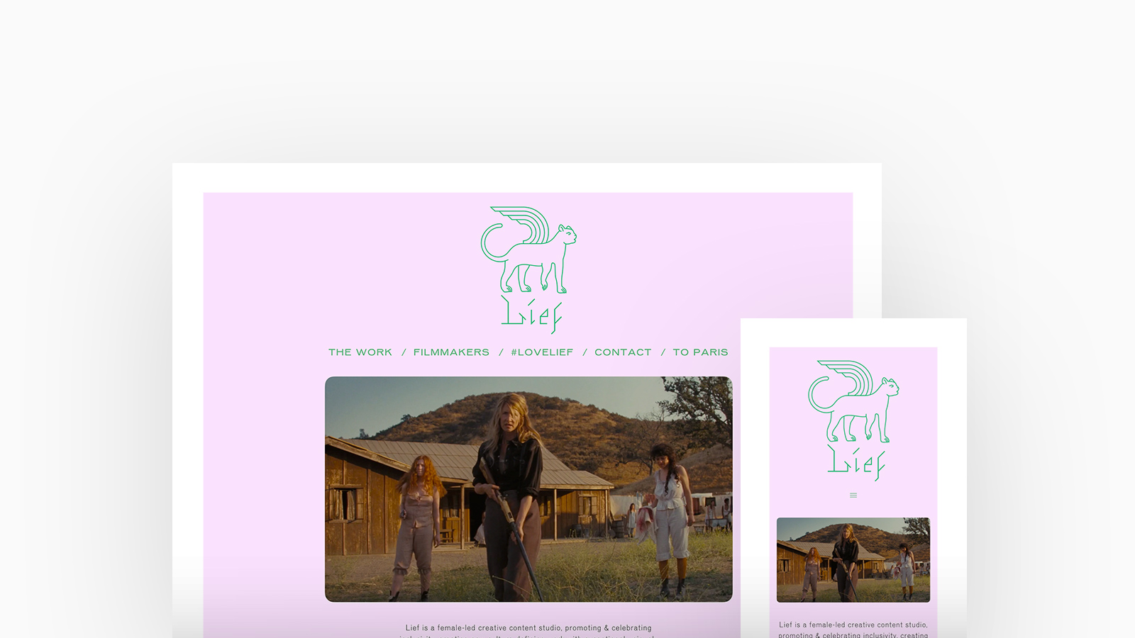
Lief Production Company. Theme: Poplin, Colour Palette: Teal and Pink
Studios and Agencies each have a specific brand style and often assimilate color into their portfolio to maintain a consistent brand aesthetic. The use of a darker background helps accentuate texture and tone and for compliments those with a moody aesthetic.
How Studios and Agencies build sites on Fabrik
You've got the inspiration, it's time for you to join the world's leading Filmmakers, Artists, Photographers and Designers. Start your free trial and build your portfolio now.


