The Summary: How your sites look in 2024
We like to check in with our community and explore how you prefer to use Fabrik. Your creative portfolio should be a well-structured compilation of work demonstrating your ingenuity, skills, and thought process – A visually unified, seamlessly integrated curation of creative projects, meticulously planned and presented like a whole product. We handle the technical details, leaving you to focus on the content.
Jump straight to the sections:
Themes
Homepage Layouts
Project Layouts
Image Crop Ratios
Colours
1. Themes
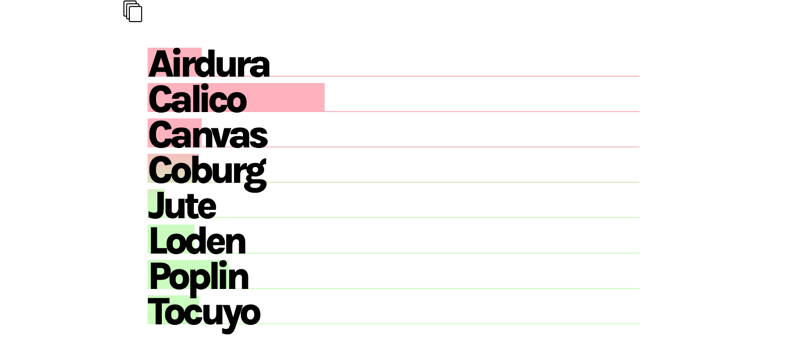
Calico remains the favourite choice of theme across our community and is favoured by filmmakers, 3D and VFX artists in particular.
Our themes employ smart layout technology to adjust to your project content. To simplify things you can change your theme anytime. Trial users frequently ask us which theme they should choose for their portfolio sites. In the end, there's no right or wrong theme to use - it's about discovering the layouts that highlight your project content most effectively.
↑
Voile
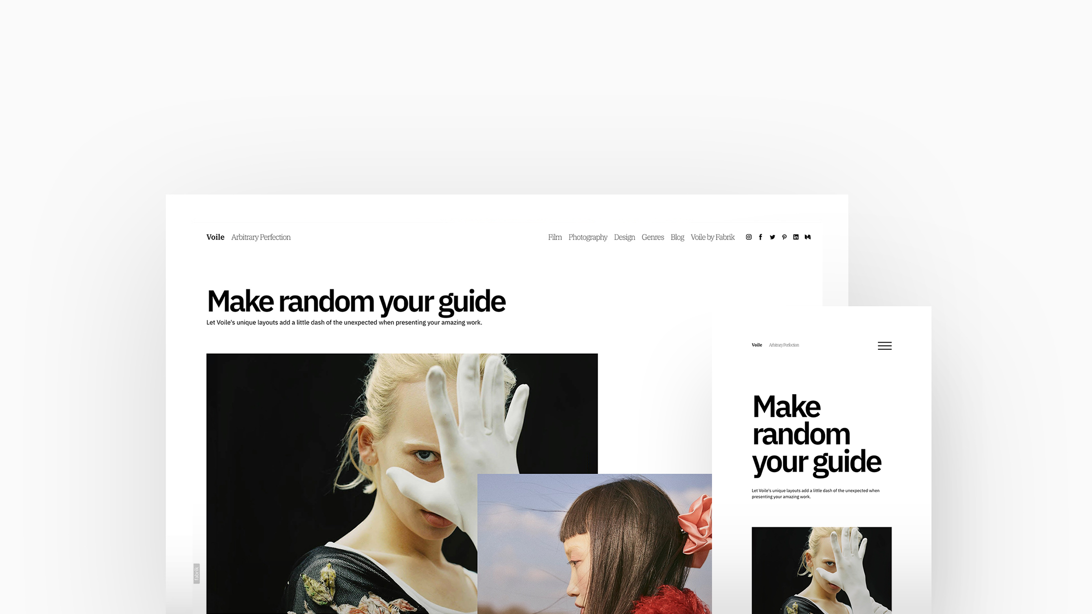
So new it's not even on the list yet! With Voile, we've taken creativity to new heights to provide you with an exceptionally unique website. Exciting customisations give you much greater control over your homepage, while our new Random, Offset and Split project layouts present your content in charming and unforeseen manners. We urge you to let Voile reflect your style and add a dash of excitement in presenting your exceptional work.
↑
Tocuyo
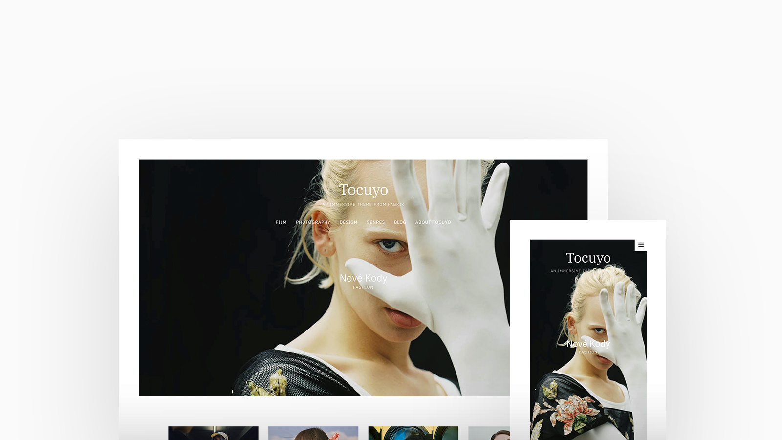
Tocuyo is especially favored by artists, but also works well for cinematic filmmakers and photographers who want an immersive, full-screen format for their work. Ideal for creatives who wish to present both themselves and their work, Tocuyo offers a range of Cover layouts and becomes highly engaging with a full-screen hero, thumbnail grids, and integrated About content. It's well-suited for medium-sized portfolios.
↑
Coburg
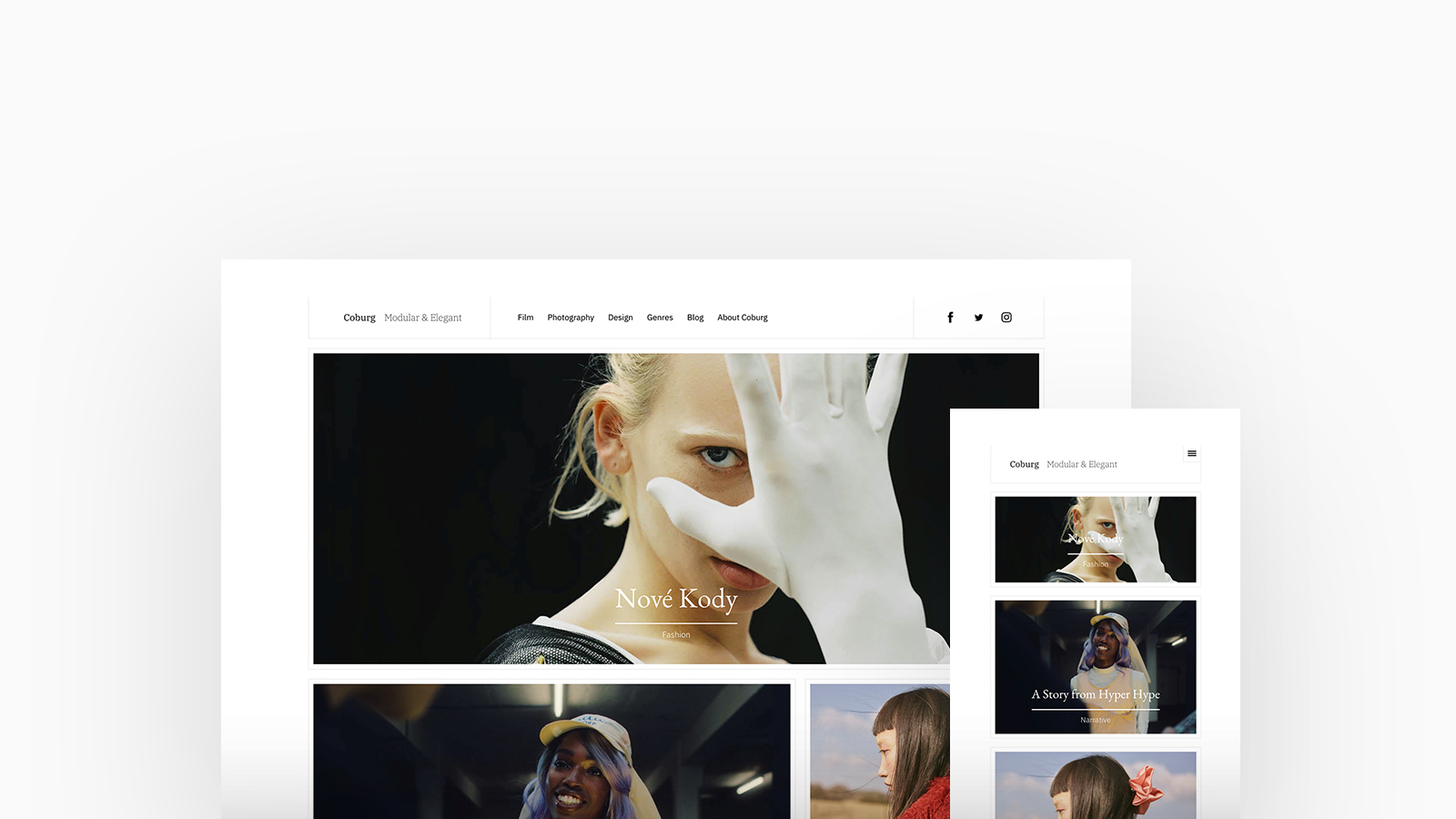
Coburg, a magazine-style theme, introduces Fabrik's Scatter layout. Popular with Studios and Agencies - its elegant typography and optional frame borders help arranges disparate project content harmoniously within guttered containers.
↑
Airdura
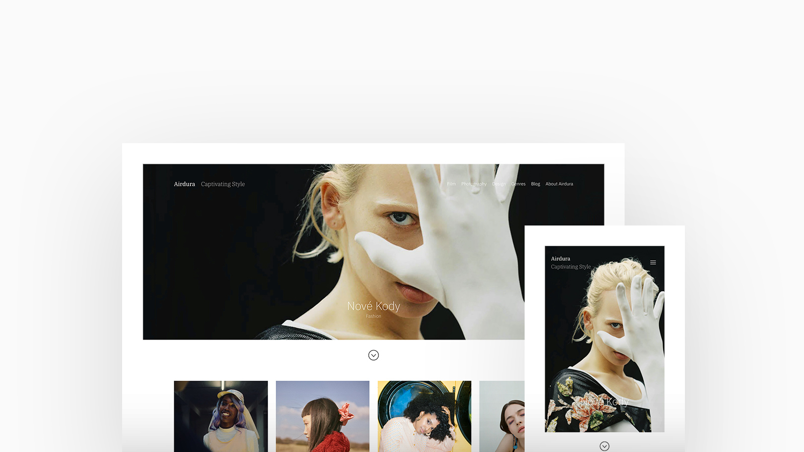
Airdura is an engaging and minimalist theme that combines polished typographic elements with full-width images and distinctive block styles. Boasting over twenty layouts to choose from, both Designers and Filmmakers alike use Airdura for its capacity to display a truly unique portfolio and present projects flawlessly.
↑
Jute
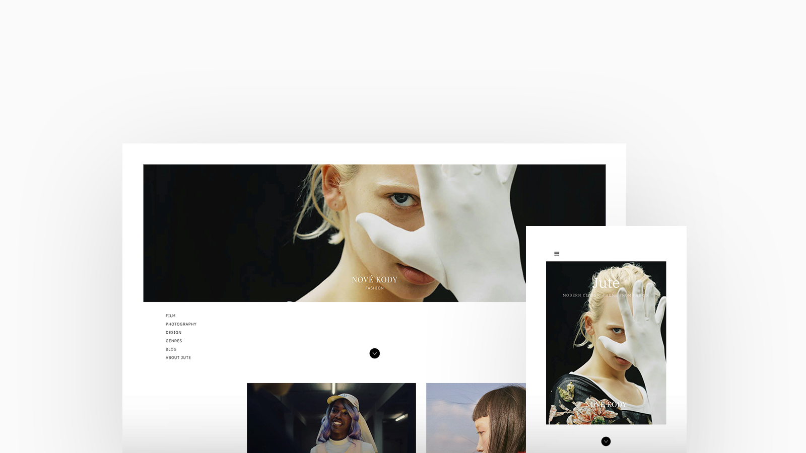
A contemporary classic styled theme featuring timeless typography and design. It includes full-width cover images, homepage layouts with a left-aligned menu and responsive sidebar. The expansive, stunning imagery is highlighted by excellent layout options – a favorite among various creative professionals, with over 25% being Stylists and Filmmakers. Jute includes a strip project layout for displaying portrait images in a horizontally scrolling page.
↑
Calico
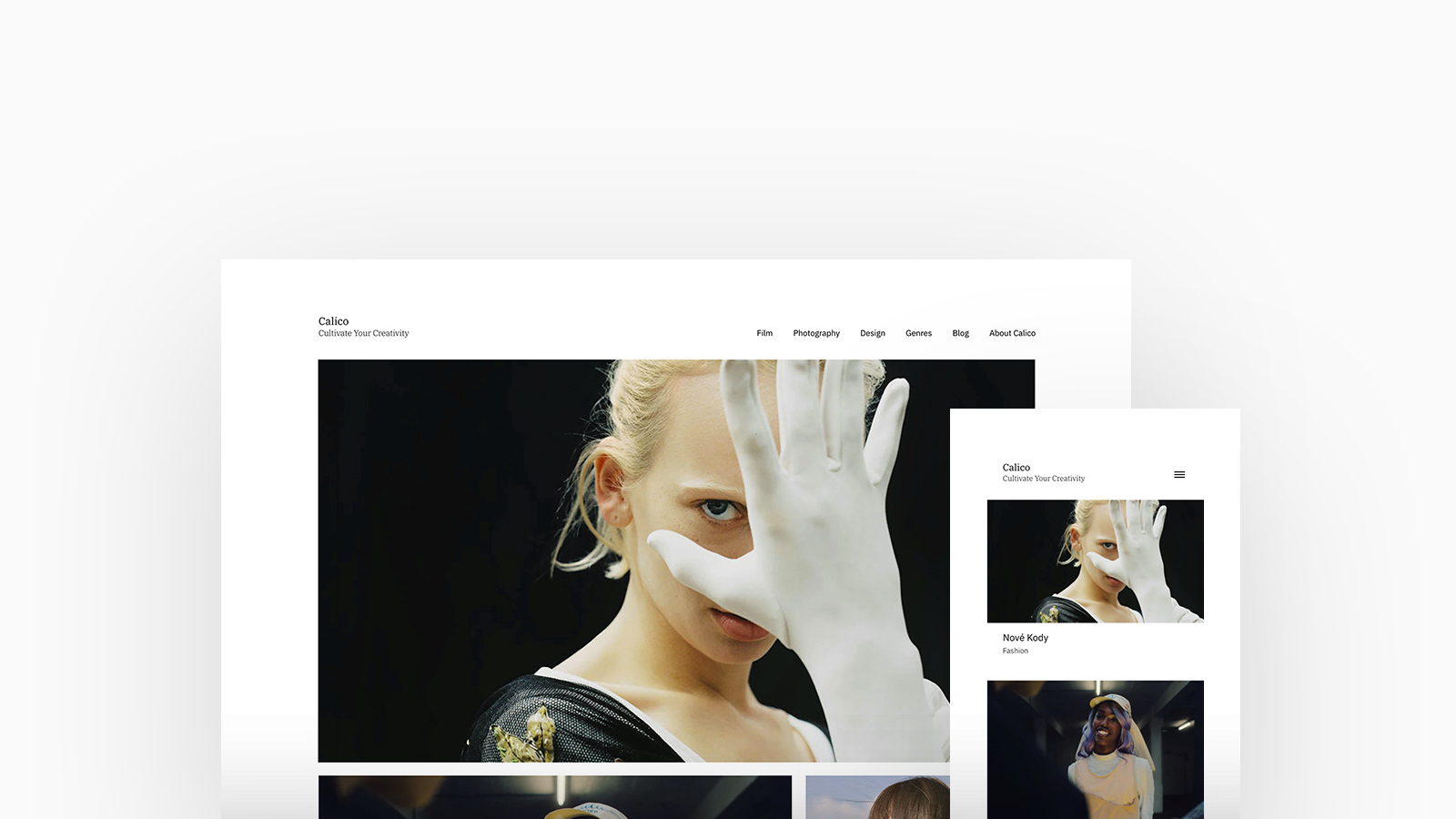
Calico is a magazine-style theme, and the first to offer Fabrik's unique spotlight homepage, portfolio and project layout options tailored for showcasing long-form projects and blog posts. An impressive 60% of 3D, VFX, and CGI Artists have selected Calico, leveraging its extensive customization features.
↑
Loden
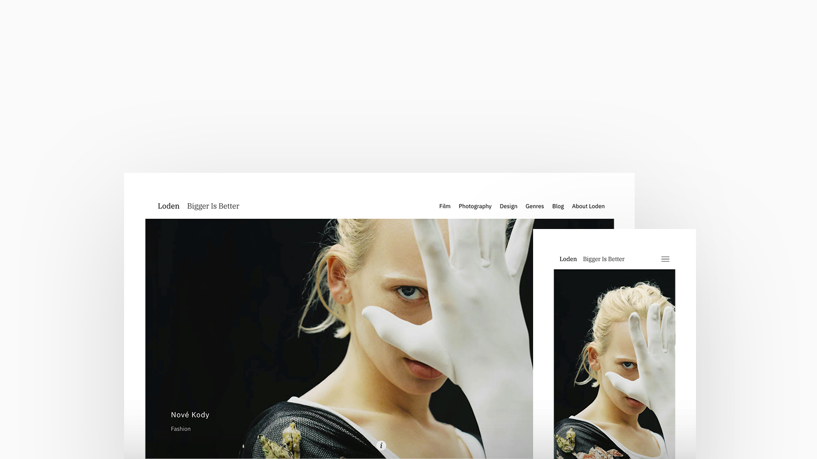
With Loden, bigger truly is better; Loden has become popular over the last couple of years with cinematic focussed portfolio sites - as this theme emphasizes maximizing the size of photos and videos. Loden is bold and sought after by both Filmmakers and Artists, with over 25% choosing it to let their visuals and videos speak for themselves.
↑
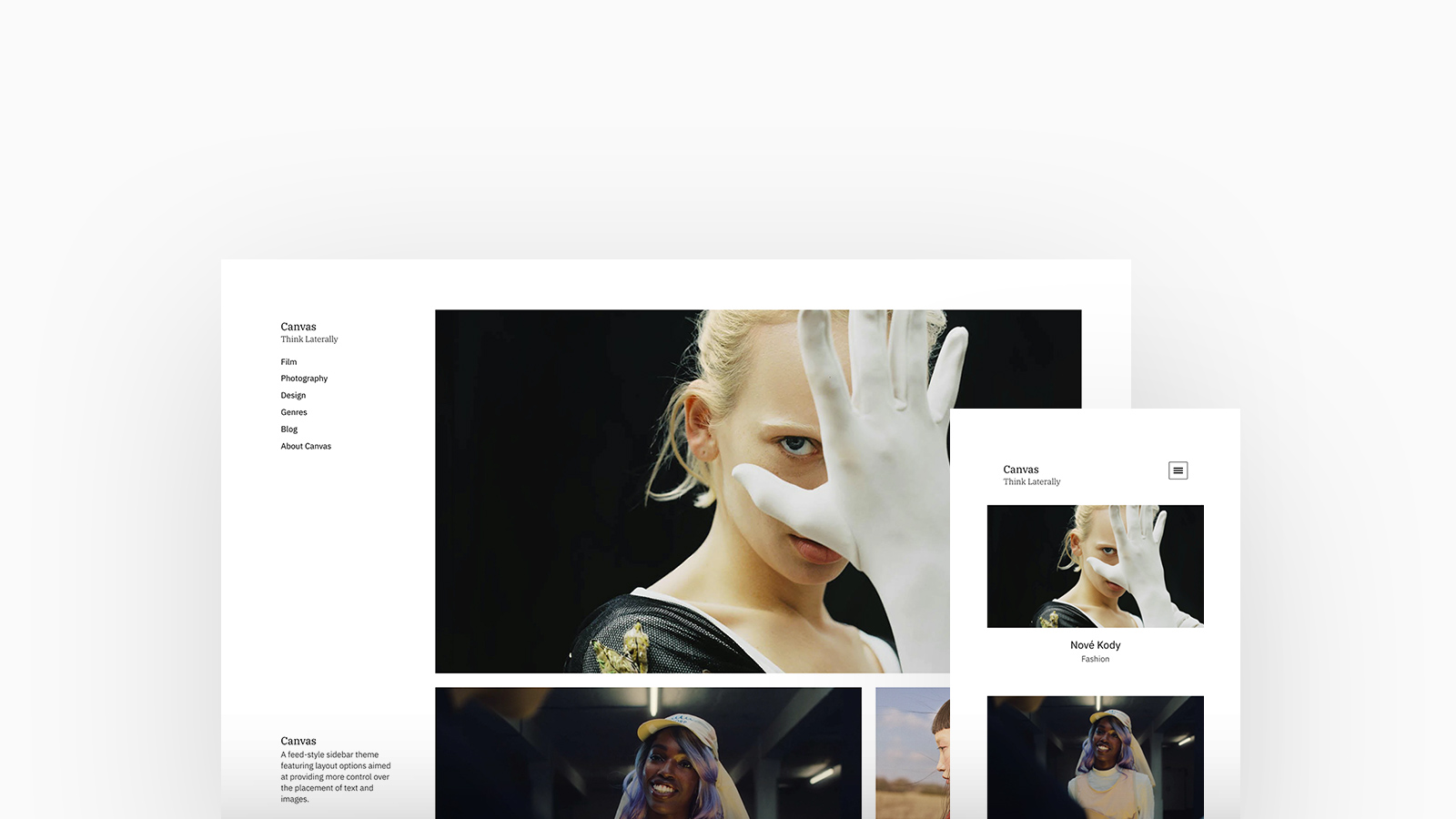
Canvas
This feed-style theme includes a sidebar and layout options designed to offer greater control over the arrangement of text and images. It's a popular choice, favoured by Photographers who shoot candid style for its capability to display images in both un-cropped and portrait formats.
↑
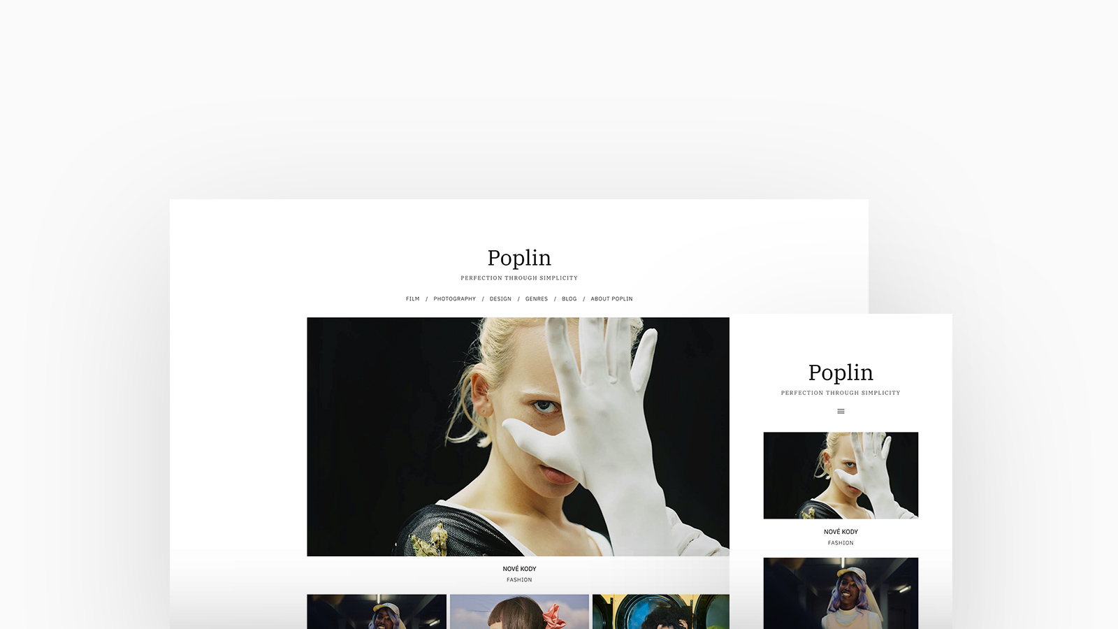
Poplin
This highly adaptable and straightforward theme has seen a renaissance in recent years, and is well-loved by Studios and Agencies. Offering numerous layout options to help you establish a unique style for your website. Emphasizing simple thumbnail grid layouts, it's particularly useful for creatives with a large number of projects.

2. Homepage Layouts
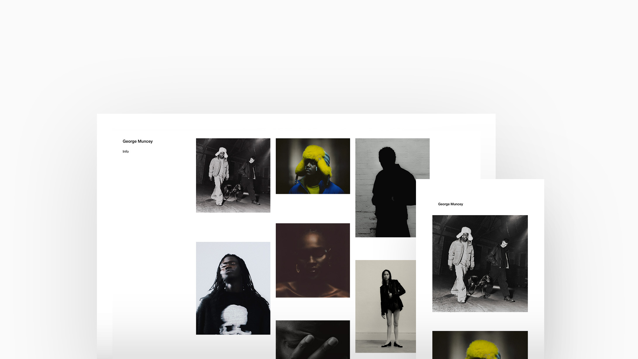
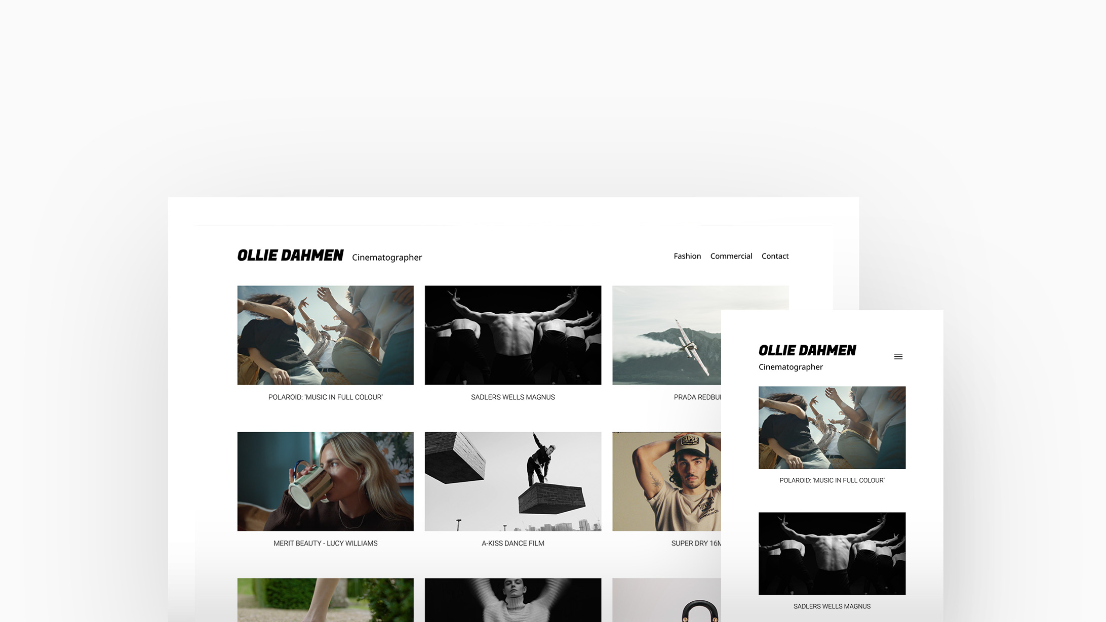
Over half of our Fabrik community prefer to show their project thumbnails up front rather than introduce themselves with a cover image, video reel or slideshow of highlighted work.
Evidently favoured by creators across all creative genres, a thumbnail homepage layout is an excellent option when aiming for show your audience one project at a time, rendering thumbnail and grids to be beneficial layouts for showcasing an array of projects easily. It's a flexible arrangement well-suited for most creators with diverse media types and aspect ratios.
↑
George Muncey Photographer, Director & Creative Director. Theme: Canvas, Homepage Layout: Thumbnails
↑
Ollie Dahmen Cinematographer. Theme: Airdura, Homepage Layout: Thumbnails
3. Project Layouts
Layouts are designed to work within themes to give individual projects the flexibility they need. This allows you to present each to its fullest.
Every theme we offer includes a set of layouts for your homepage, your portfolio pages and your projects. Each layout is tailored for specific media aspect ratios or presentation styles. Whether your images are in portrait or landscape format, or you aim to showcase video and images uniquely, there will be a layout choice that suits each of your projects optimally.
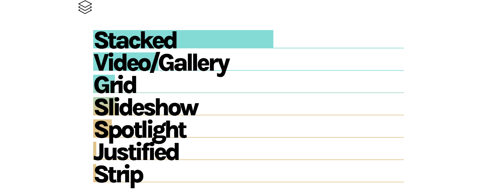
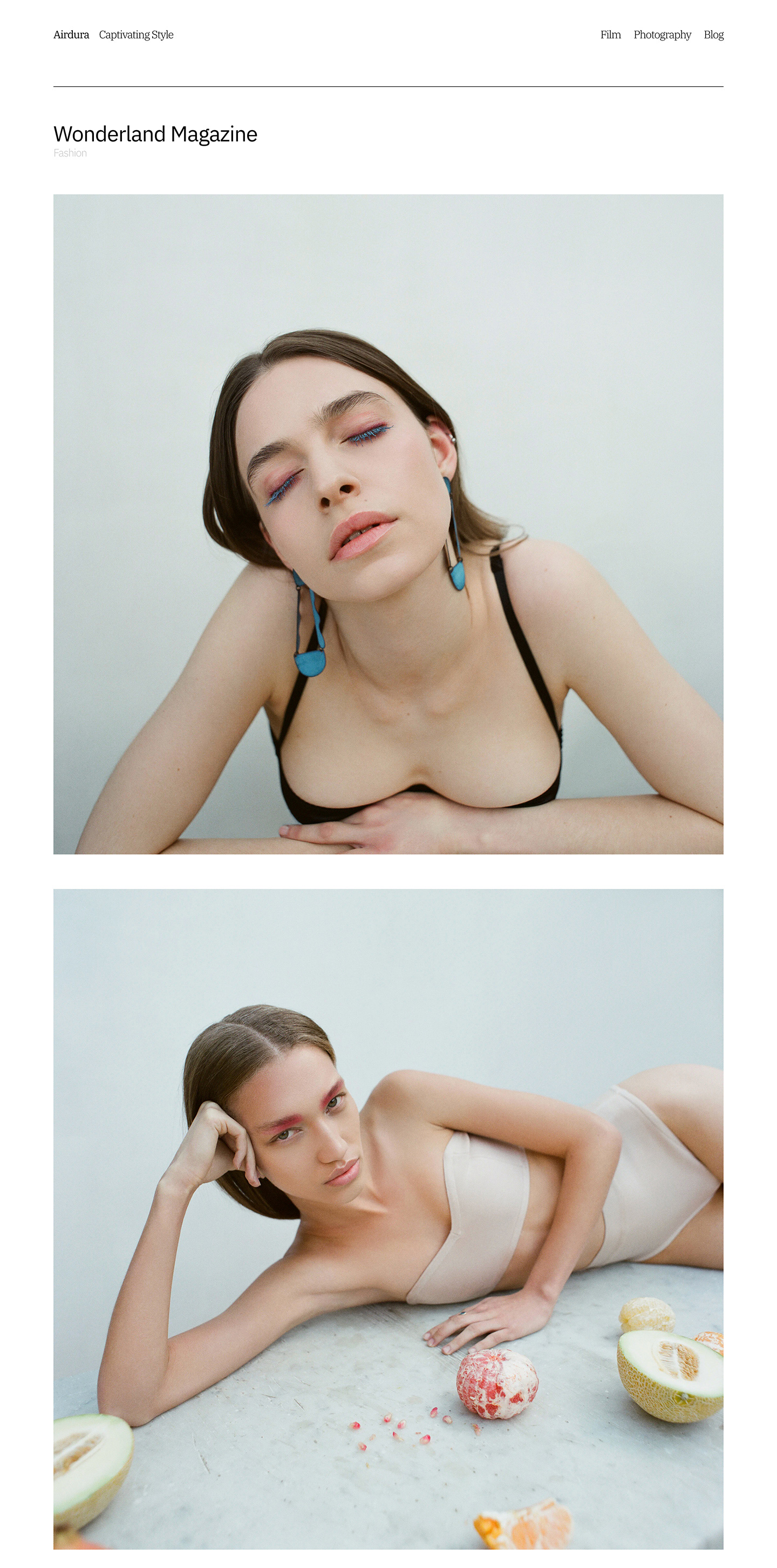 | Stacked Stacked is an exceedingly uncomplicated and lenient layout, accommodating a range of media types and sizes. Opt for a stacked layout if your project encompasses media with diverse aspect ratios or if you prefer a layout reminiscent of a feed. It's an excellent choice for presenting your project as a case study or narrative journey. |
A top-pick across all creative groups, our Stacked layout is perfect for longer form projects or a variety of media formats and accounts for almost three fifths of all project layouts.
Gallery & Video Gallery employs a set aspect ratio and may trim your media to fit the frame, making it particularly suitable for projects with consistent aspect ratios across all media. An ideal option for photography and film projects originating from a single shoot or with a specific theme Video layouts are similar to Gallery layouts, except that any video items in your project will always appear at the top in the large preview area, making it a popular choice for DoP's and Cinematographers who present a video with their preferred stills underneath. | 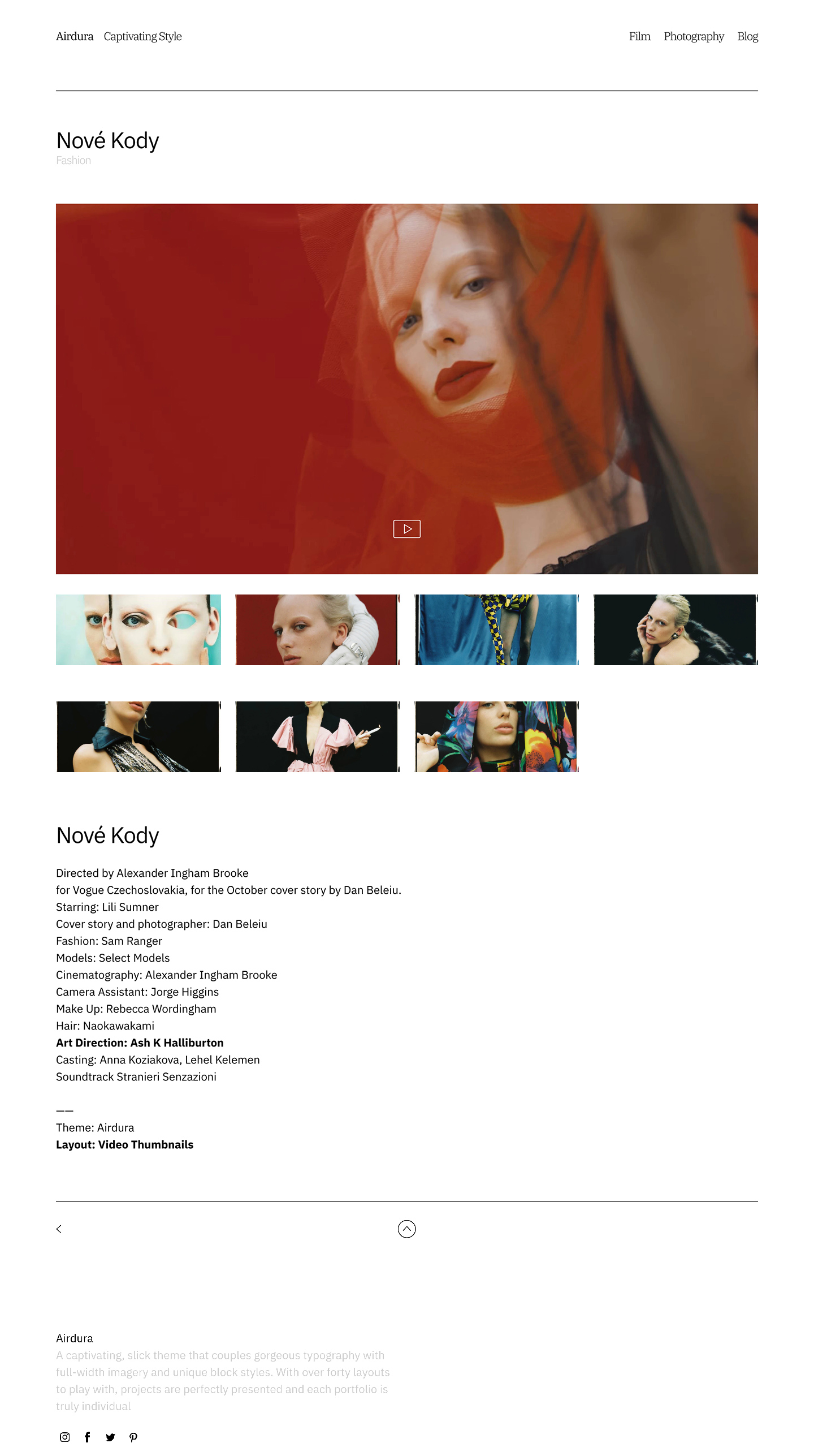 |
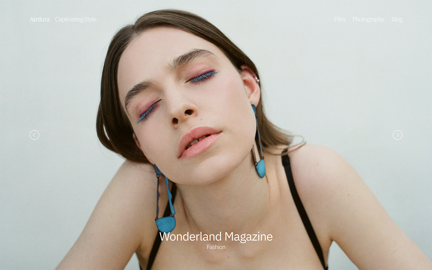 | Slideshow Slideshow is suitable for projects with uniform aspect ratios across all media and can be advantageous for assembling a portfolio of unrelated work or presenting your project in a predefined sequence. |
Spotlight If you aim to showcase particular projects from your portfolios or significant media within a project, without appearing cluttered or overwhelming, then this layout is ideal for you! In each row, the width and height of the spotlight are harmonised using a straightforward mathematical formula - ensuring that the height of the two thumbnails perfectly matches the height of the larger thumbnail, albeit your smaller media items may undergo slight cropping. | 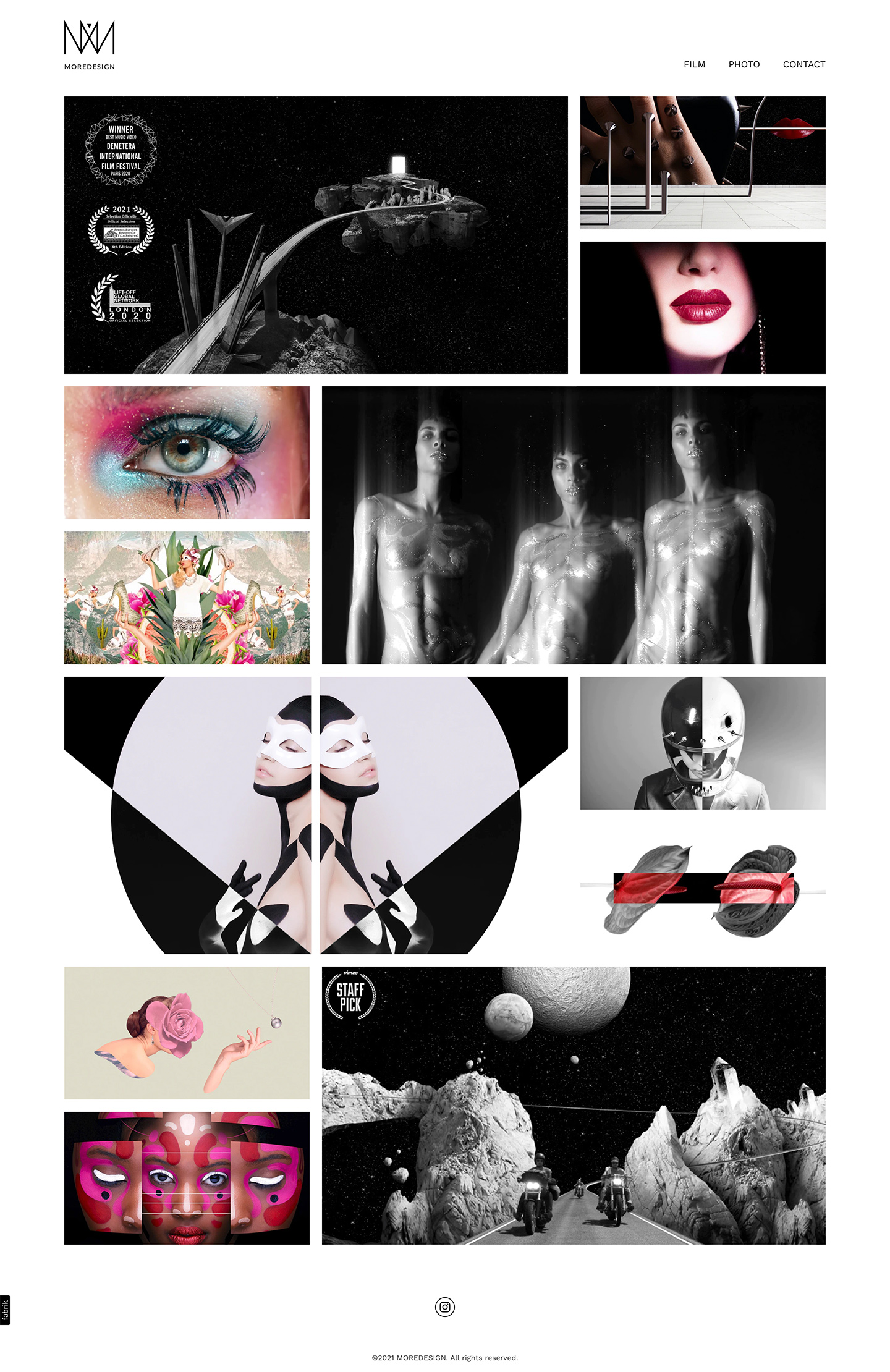 |
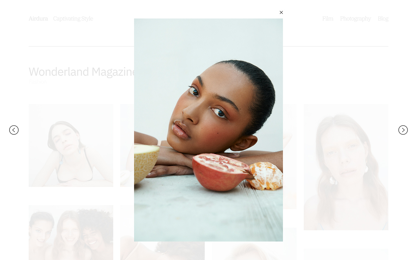 | Lightbox Lightboxes are a great choice if you want your audience to focus on a single media item at a time, making it a useful layout for viewing video and imagery with a lot of detail. This layout is versatile and suits projects that have varied media types and aspect ratios. |

Strip
Every media item in your project is showcased in a single row horizontally, utilising the entire vertical space of your browser. Media transitions from right to left as your audience navigates through your project media using the next button, or by swiping on a trackpad or touchscreen - concentrating on one item at a time. Strip is an excellent layout option for photographic projects featuring media with diverse aspect ratios or projects primarily composed of portrait or square images.
Random | 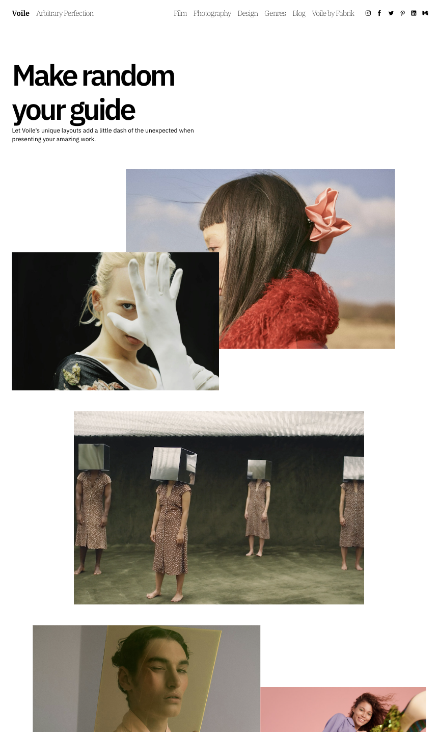 |
↑
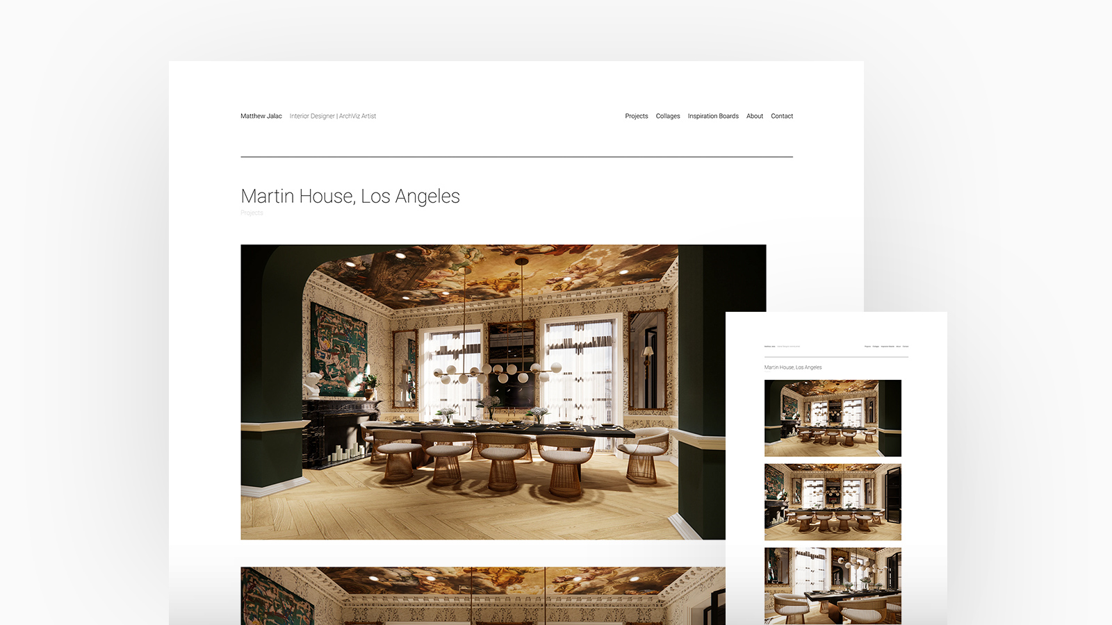
Matthew Jalac Interior Designer. Theme: Airdura, Project Layout: Stacked

4. Image Crop Ratios
You're fond of landscapes, and so are we. With slightly more than half of you selecting a landscape ratio for your Fabrik site.
It's fair to mention that Filmmakers show a distinct preference for landscape ratios, but they're not the only ones. A portfolio presented in landscape format is favoured by most of our creators because it enables them to exhibit a variety of projects in various formats, ranging from image stills to video.
Discover how Filmmakers use Fabrik
In contrast to other creators, Photographers often exhibit their images in a variety of ratios, yet the majority choose to present their work without cropping, allowing it to be viewed in its entirety.
Photographers on Fabrik: A Deep Dive
We hold the view that 3D, VFX, and CGI Artists grapple with the decision between an uncropped, square, or landscape image crop, given their infrequent adherence to specific aspect ratios. They believe that each project should be displayed to accentuate the dimensional facets of their work.
See 3D, VFX and CGI Artists on Fabrik
Being the sole creator type showcasing all crop groups, Stylists and Models stand out in this regard. Frequently provided with images directly from the photographers or representatives they collaborate with, Stylists and Models typically have less influence over the presentation of those photos.
How Stylists, MUA's and Models use Fabrik
Artists operate in various mediums, with most choosing an uncropped ratio. This enables them to engage viewers and fully immerse them in the thought process and deeper meaning behind their work, providing a similar experience to being in an art gallery.
How Artists build coherency across disparate works
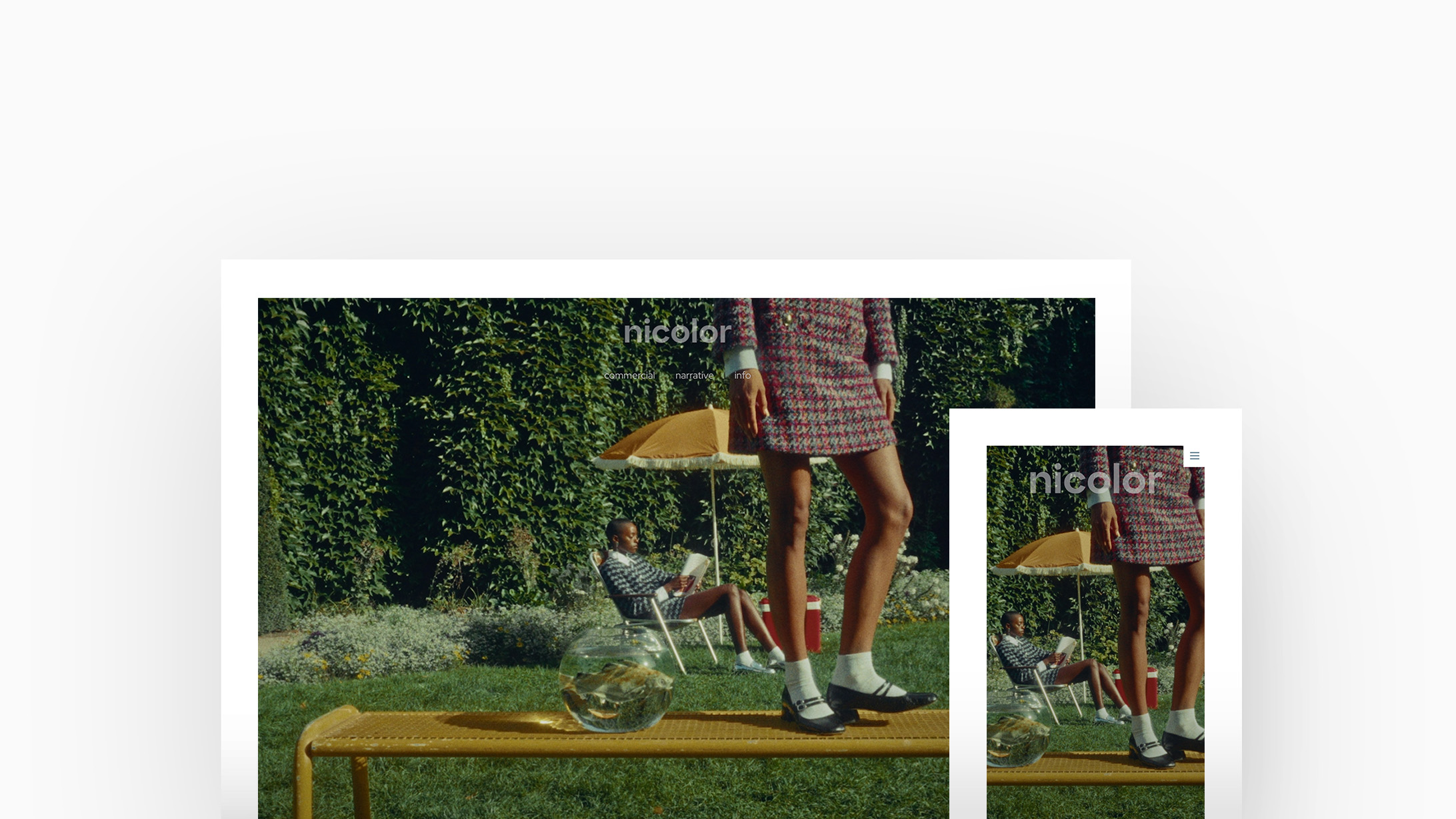
Studios and Agencies collaborate closely with a large number of creatives across various fields, and presenting their portfolio in landscape format enables them to exhibit a range of projects, from image stills to video.
Studios and Agencies on Fabrik
↑
nicolor Production Company. Theme: Tocuyo, Image Ratio: Landscape

5. Colours
Simple is best. The majority of our creators opt for a clean-cut white background with black text.
However, not all members of our community share identical sentiments. Displaying imagery or video content on a dark-themed website enhances texture and tone, while a splash of color adds a personal touch. A darker backdrop is typically combined with white or light grey text to provide a complementary contrast.
3D, VFX, and CGI Artists prefer a black background with light text to make their projects stand out, whereas Studios and Agencies appreciate adding a touch of personality and were discovered to be the creators who showcased the most variety of colours.
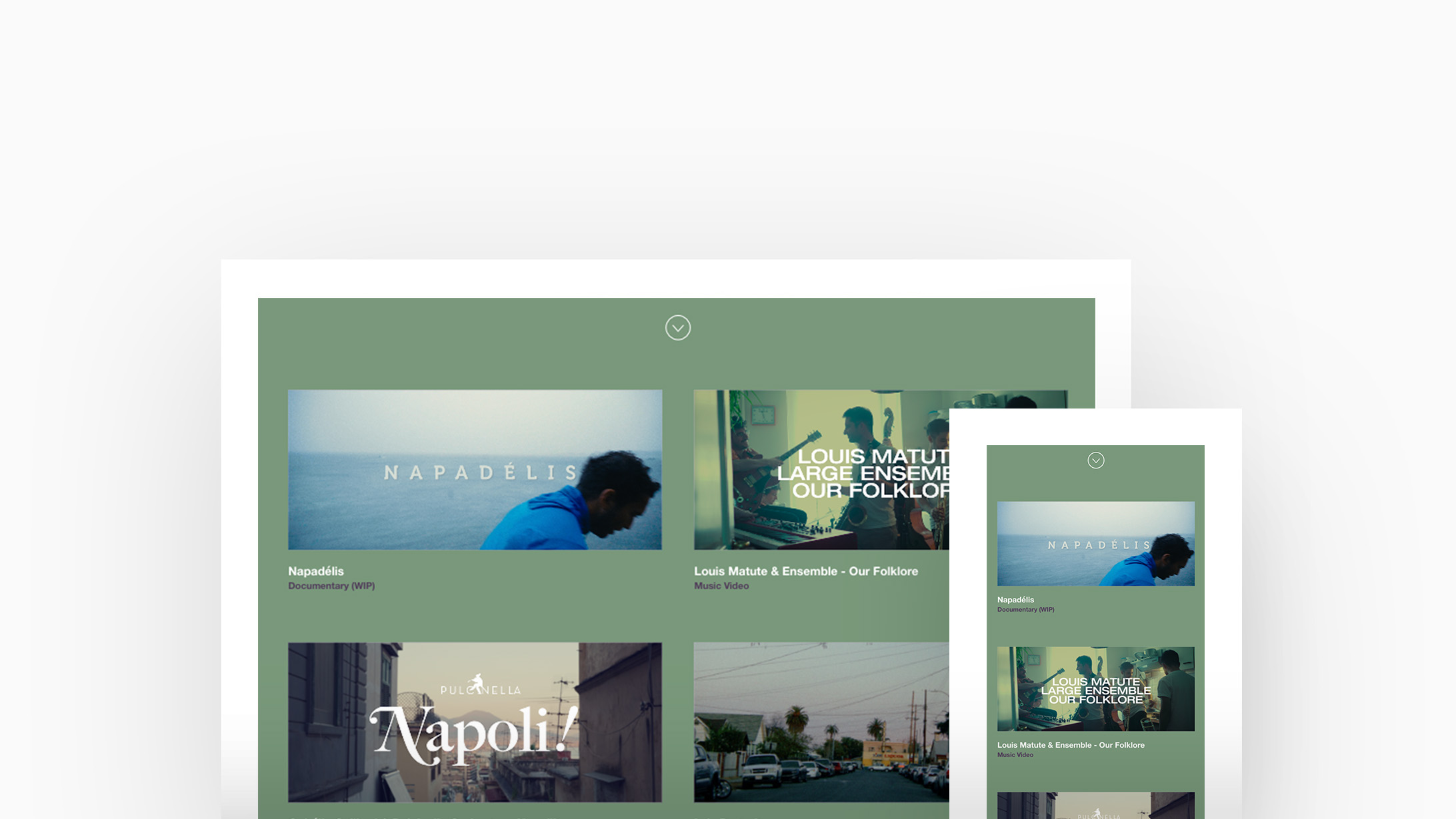
illustrators presented work with similar colour tones and swatches. Undoubtedly, this is intentional on the illustrator's part - utilising palettes they are familiar with and adhering to colour trends over time. While a simple white background and black text continue to reign supreme, employing closely matched colour palettes offers opportunities to incorporate more distinctive background colours that enhance flat artwork.
Artists frequently allow the colours and tone within their artwork to shape their portfolio and select a plain white background with black or grey text. Some Artists restrict themselves to specific colours in their palette, so they might decide to integrate a hint of these colours either in the text or as the background across their portfolio to complement their artwork.
↑
PÁRAMO Production Company. Theme: Airdura, Colour Palette: Sage and Lilac
Studios and Agencies possess distinct brand styles, frequently incorporating color into their portfolios to uphold a consistent brand aesthetic. Employing a darker background enhances texture and tone, complementing those with a more atmospheric aesthetic.
You've got the inspiration, it's time for you to join the world's leading Filmmakers, Artists, Photographers and Designers. Start your free trial and build your portfolio now.


