Artists use skill and imagination to pull viewers into their world. Translating that experience to a screen turns casual visitors into gallery reps, art buyers, and paying clients.
We ran an artist portfolio analysis on 15 real-world showcases built on Fabrik. Here is a look at how top painters, illustrators, and sculptors structure their sites, and the exact portfolio themes for artists they use to do it.
What Layout Trends Emerged From the Artist Portfolio Analysis?
Looking at these creative portfolio website examples, one thing stands out: top artists don’t let site design fight their artwork. They pick simple, media-first structures that get out of the way.
1. The Full-Screen Hero Experience (Tocuyo Theme)
A third of the artists we looked at pick Tocuyo. Its cover layout gives you a full-screen hero image, clean thumbnail grids, and inline “About” text, giving visitors a strong taste of your work the second the page loads.
Andres Marti (Theme: Tocuyo)
A photographer and visual artist in Bogotá, Colombia. His series Otredad (Otherness) blends Baroque and Romantic influences to explore identity. He uses Tocuyo with a cover thumbnail homepage and stacked project pages.
“Fabrik is a perfect canvas for my work where detail shows elegantly. My favorite feature is the entrance carousel; it makes the whole presentation feel very pro.” — Andres Marti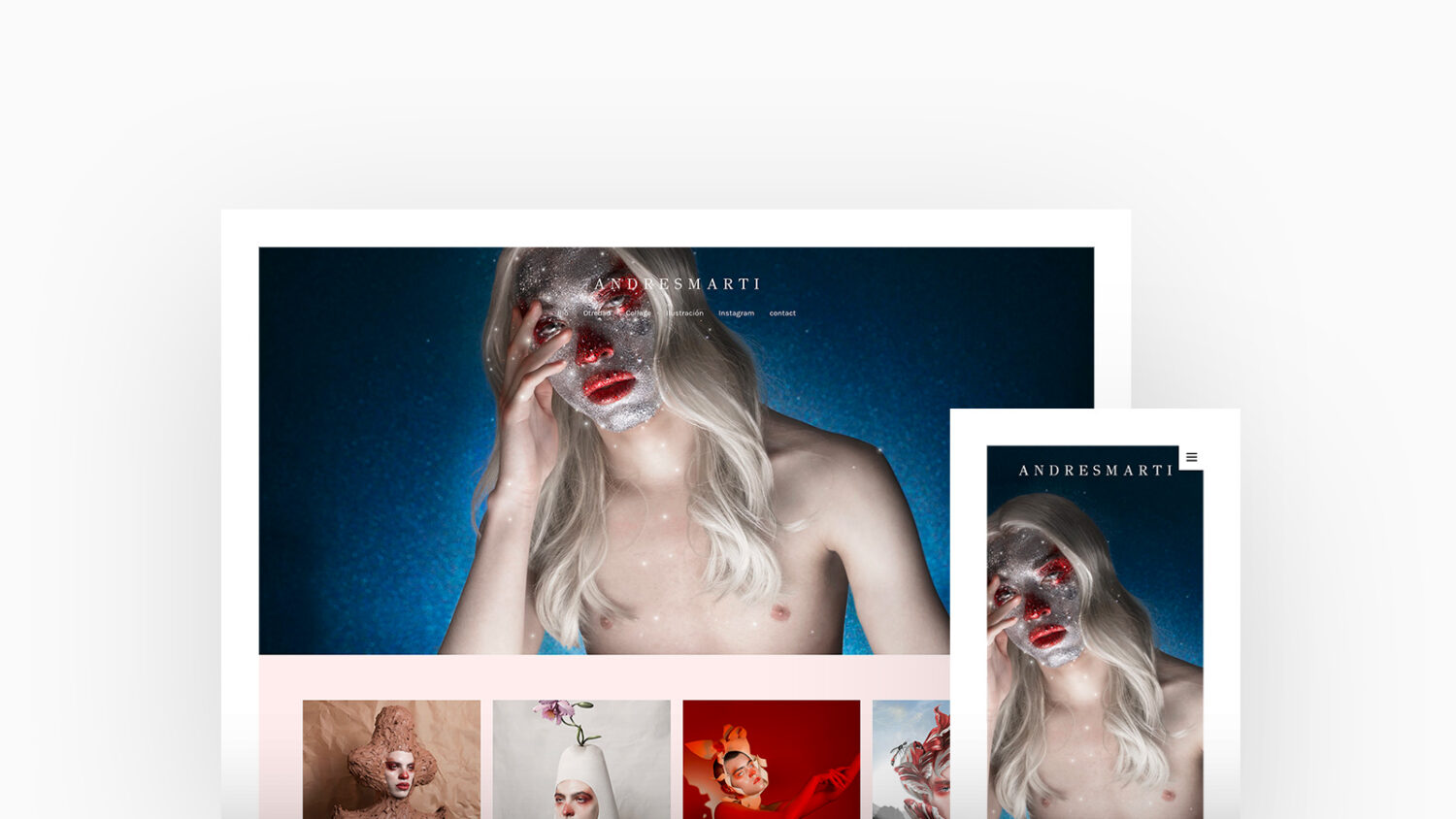
Justin Southey (Theme: Tocuyo)
An abstract artist and designer creating fantastical landscapes as metaphors for emotional spaces. Justin pairs Tocuyo with a featured-thumbnail homepage and stacked project covers.
“I love that Fabrik is simple and easy to use, and looks professional.” — Justin Southey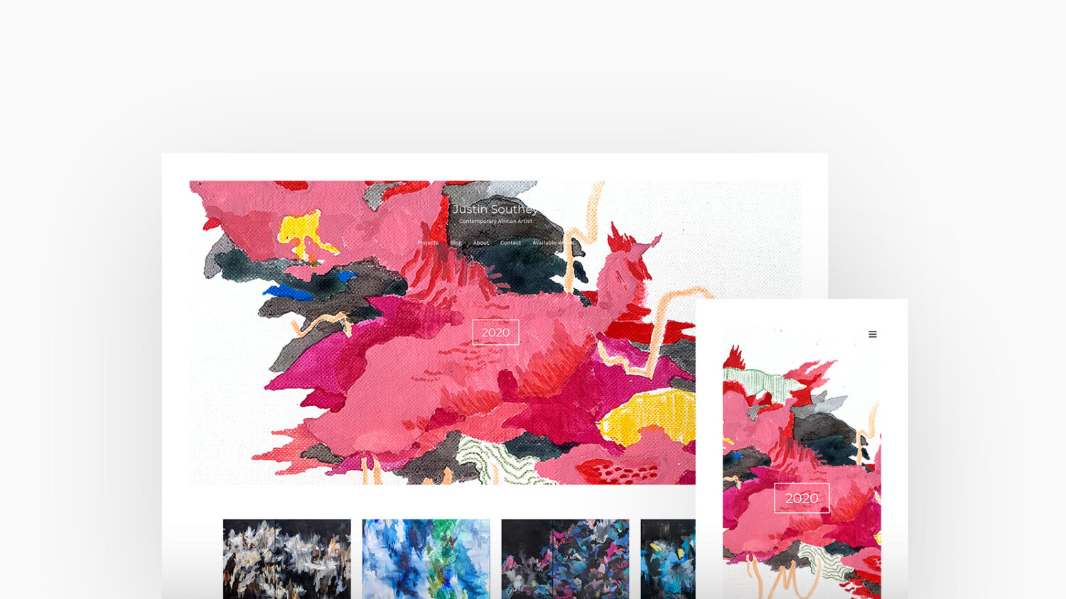
Stefan Reiss (Theme: Tocuyo)
Reiss works across drawing, painting, sculpture, and light projection to bridge art and technology. He uses Tocuyo with a featured-block homepage and lightbox galleries.
“My artwork series change all the time. Fabrik is so comfortable and multifunctional—I can reorganize my website immediately.” — Stefan Reiss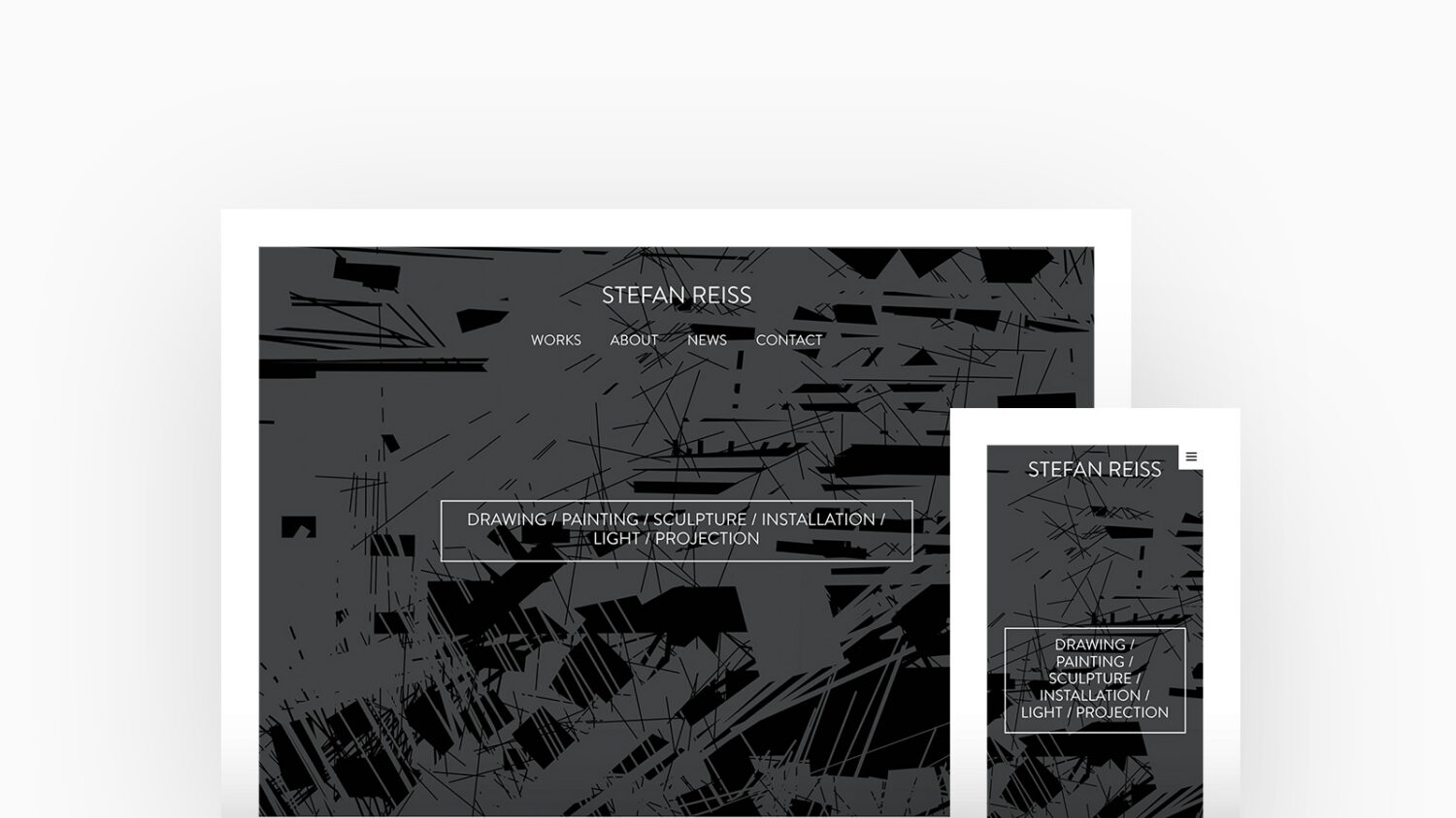
Samuel De Maré (Theme: Tocuyo)
A painter in Mechelen, Belgium, whose work captures shifting angles within a scene. Samuel uses Tocuyo with a cover homepage and stacked layout.
“Fabrik was exactly what I was looking for. It’s very straightforward, so adding social posts to my site takes just a few minutes.” — Samuel De Maré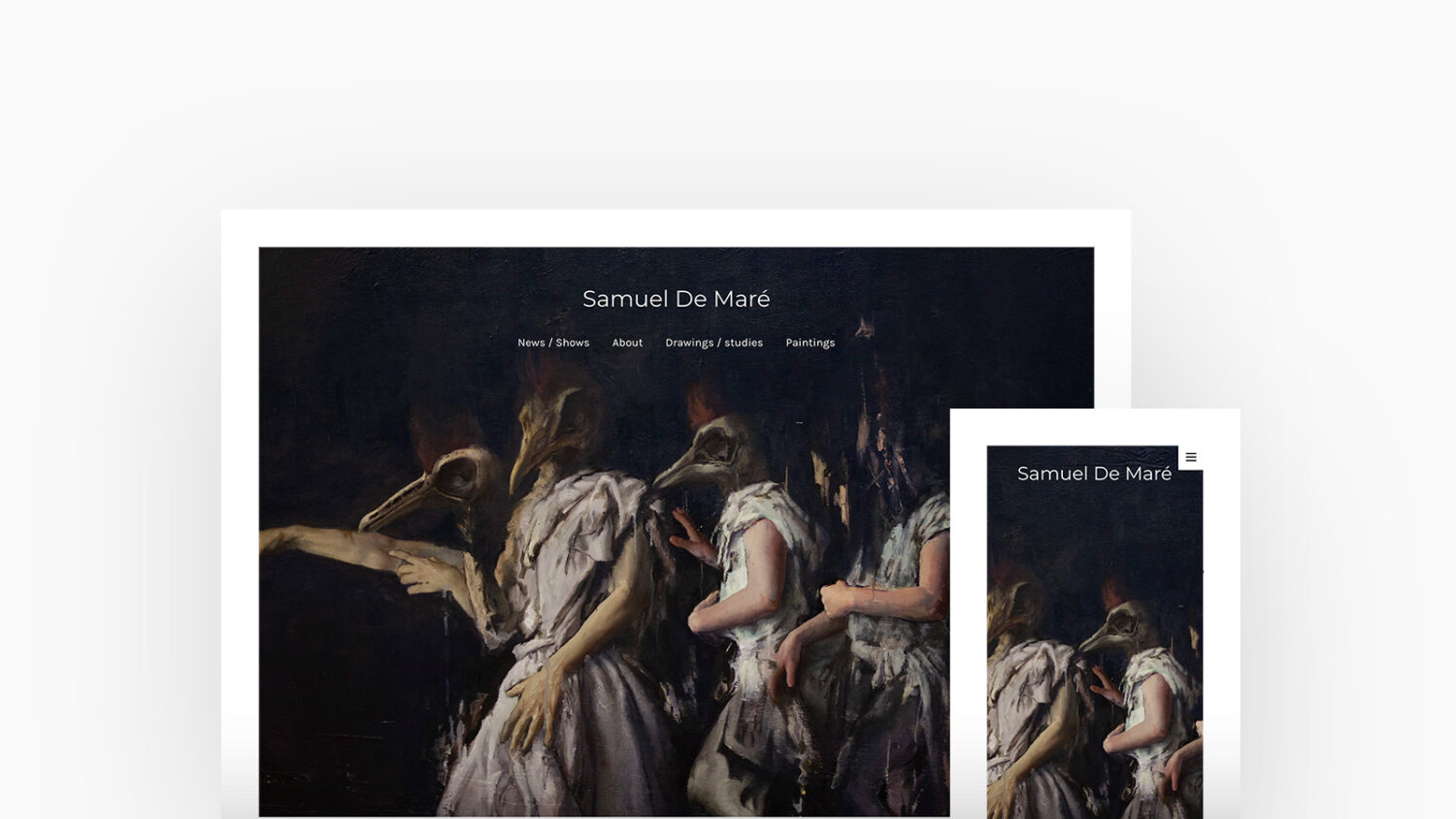
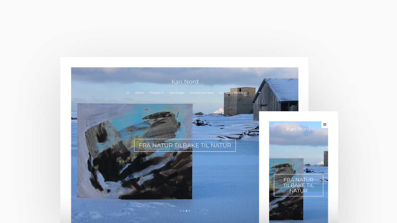
Kari Nord (Theme: Tocuyo)
An abstract painter whose process relies on direct contact with nature. She uses Tocuyo with a featured-thumbnail homepage and stacked cover project feed.
2. Feature Homepages & Stacked Project Layouts
More than 50% of the artists pair a featured homepage with a stacked project layout.
This setup lets you showcase your hero pieces in a prominent header or slideshow right away, while the stacked feed below effortlessly handles images of different shapes and sizes without cropping them into awkward squares.
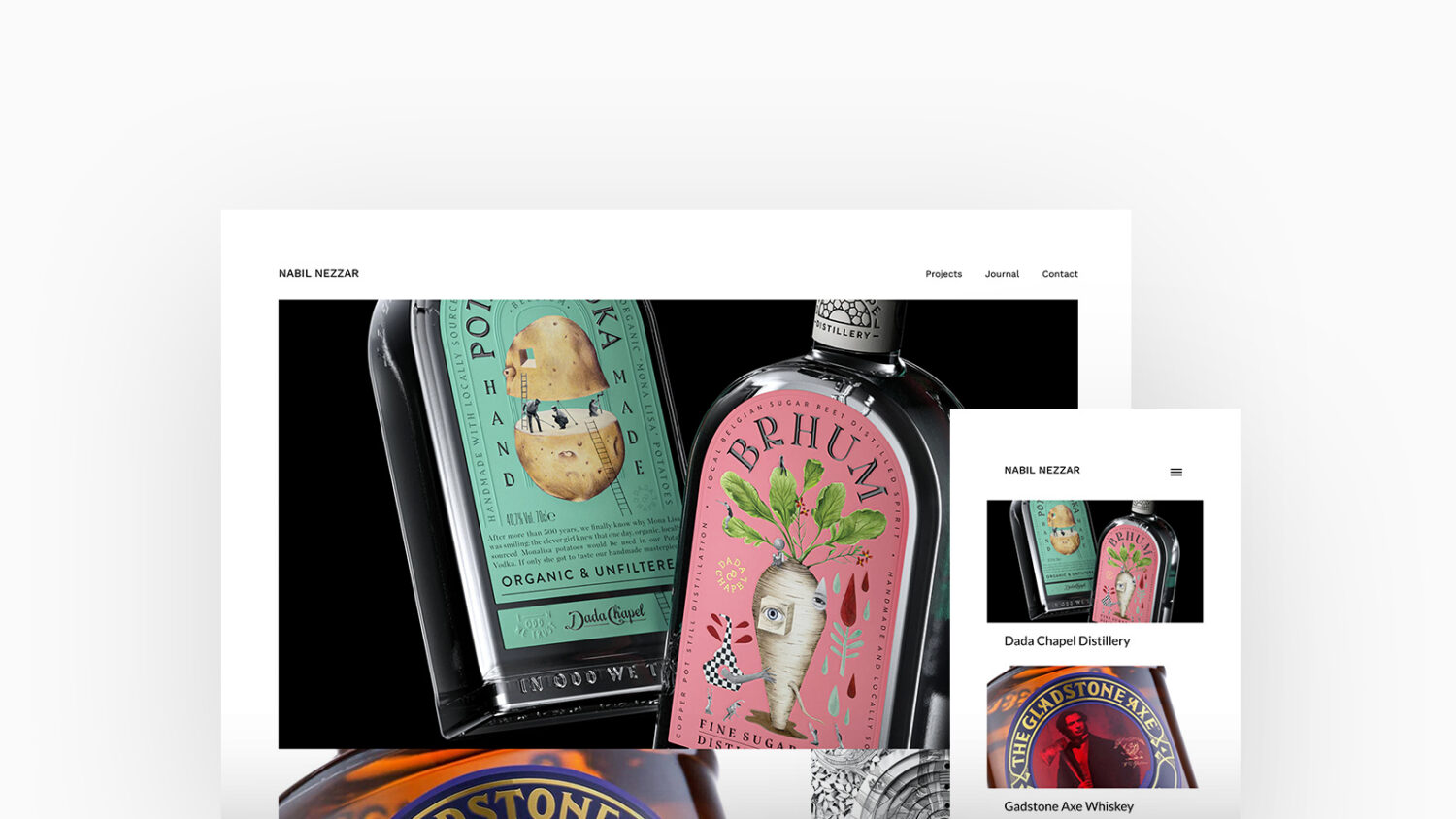
Nabil Nezzar (Theme: Calico)
An illustrator giving watercolour, graphite, and gouache a sharp, contemporary edge. Nabil uses Calico with a spotlight homepage and strip project view.
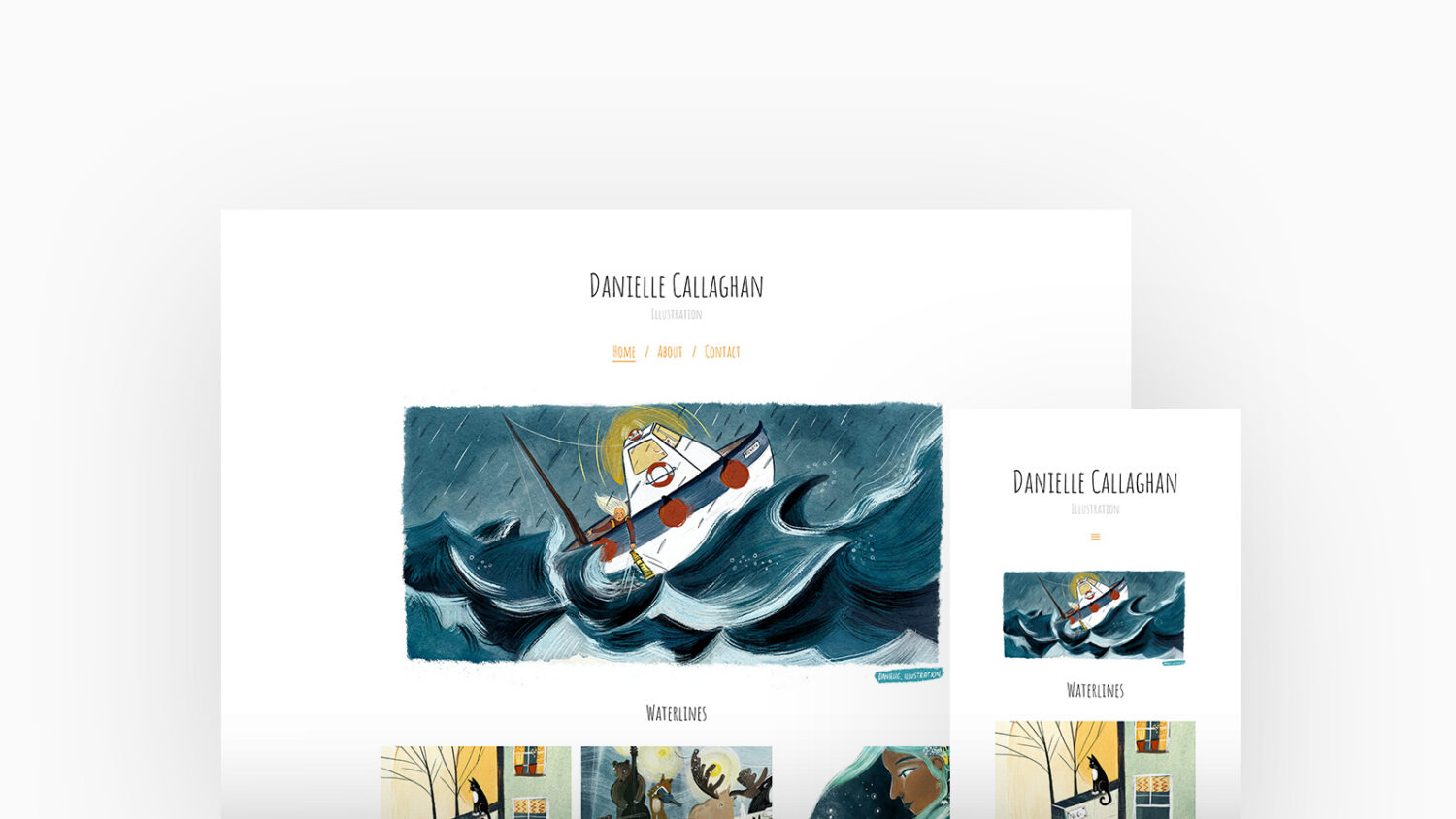
Danielle Callaghan (Theme: Poplin)
An Edinburgh illustrator creating children’s books, murals, and commercial work featuring animals and nature. Danielle uses Poplin with a featured-thumbnail homepage and gallery layout.
Lucha Rodríguez (Theme: Jute)
An artist using paper cuts and texture distortion to challenge spatial perception. Lucha uses Jute with a featured-block homepage and stacked layout.

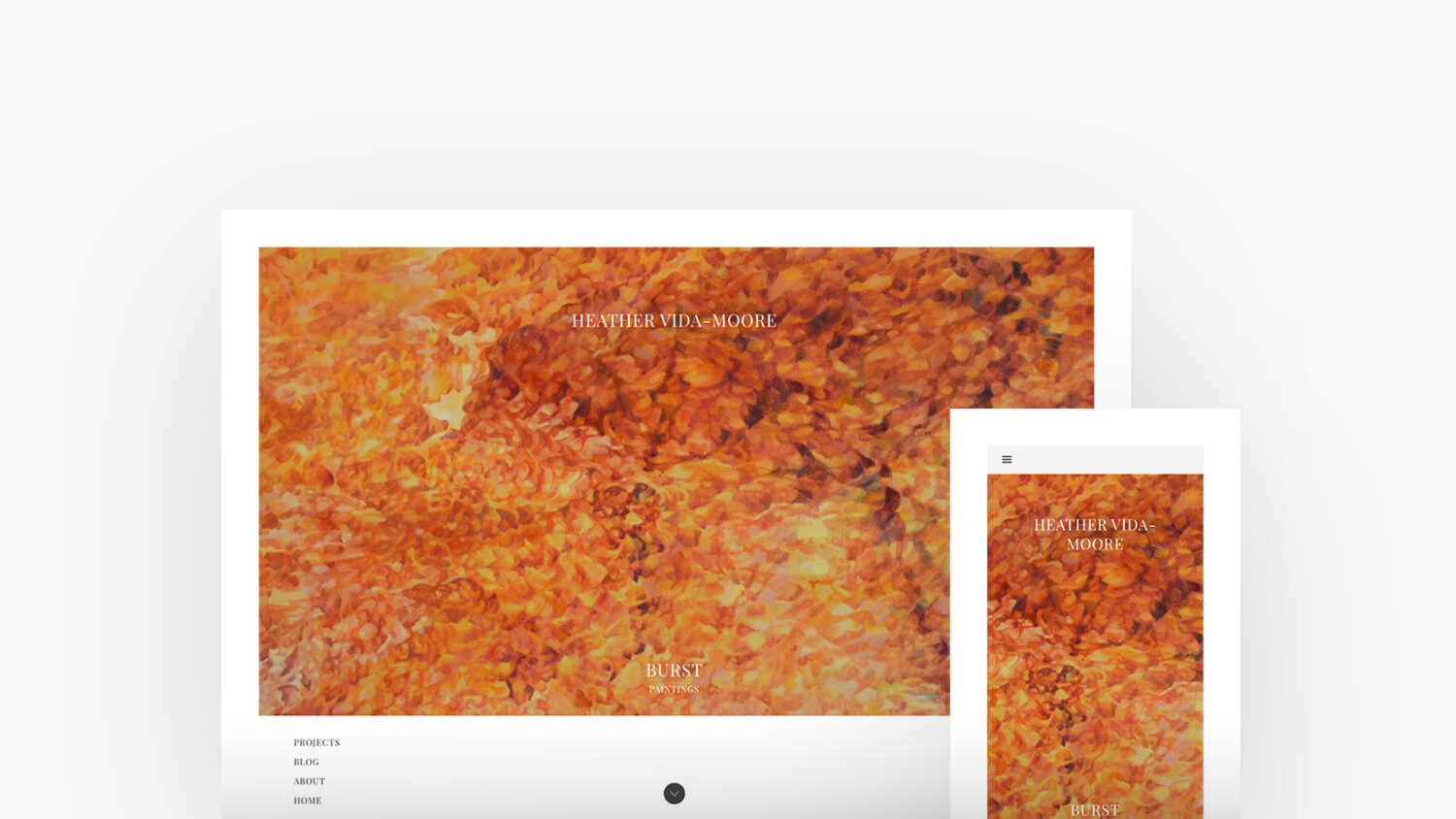
Heather Vida-Moore (Theme: Jute)
A painter based in Hamilton, Ontario, focused on organic abstract patterns. Heather uses Jute with a featured-thumbnail homepage and stacked projects.
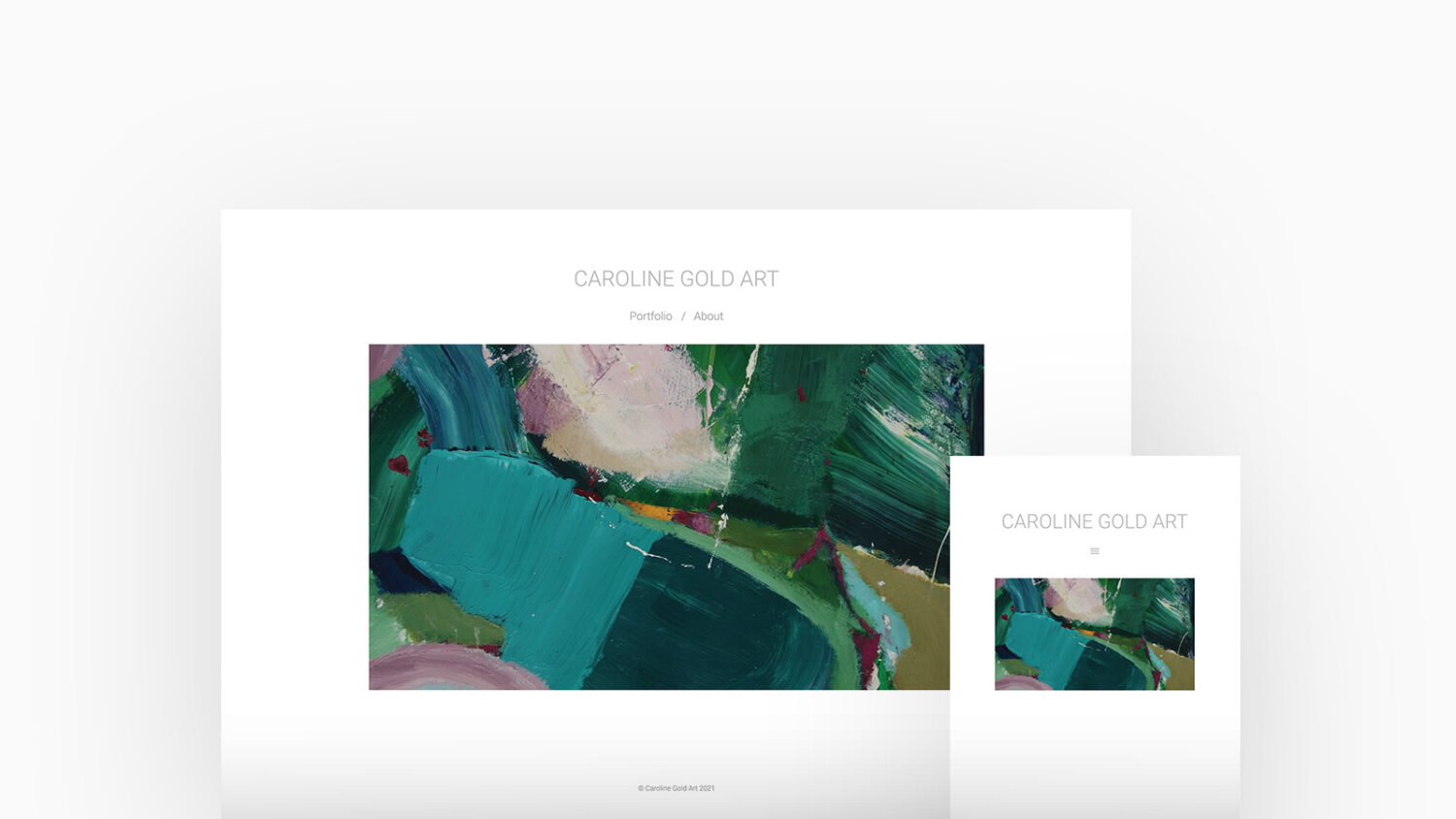
Caroline Gold (Theme: Poplin)
An illustrator turned full-time painter exhibiting across UK galleries. She uses Poplin with a featured-thumbnail homepage and stacked layout.
What Navigation Structures Keep Clients Engaged Longer?
In our artist portfolio analysis, 80% of creators explicitly choose to display their artwork uncropped.
Keeping original aspect ratios respects the original piece and gives visitors a real sense of scale. Most creators match this with a clean white background and a dead-simple menu structure.
3. Lightbox & Gallery Interactions (Loden & Canvas Themes)
Themes like Loden and Canvas focus on maximum image scale and clean lightbox popups, keeping full focus on the canvas.
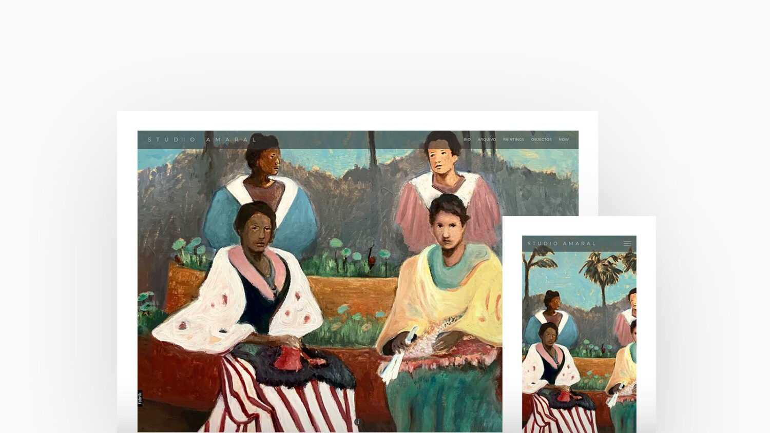
Studio Amaral (Theme: Loden)
A Portuguese studio presenting rich, textured brushstrokes across landscape and lifestyle canvases. Studio Amaral uses Loden with a cover homepage and lightbox layout.
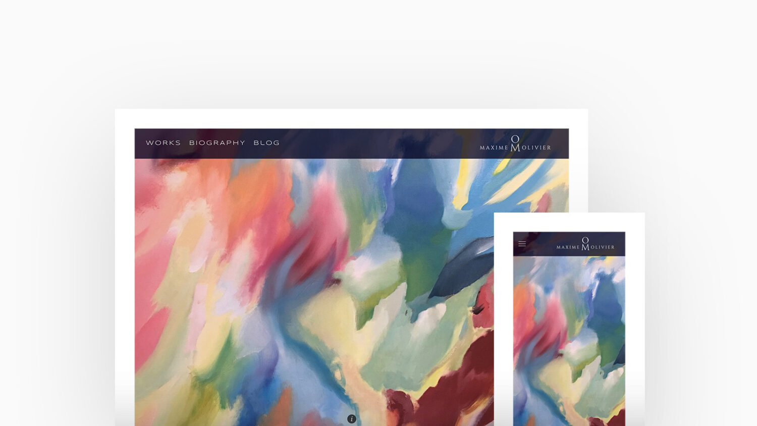
Maxime Olivier (Theme: Loden)
A large-format painter creating cosmic, immersive color spaces. Maxime uses Loden with a cover homepage and full slideshow layout.
Oliver & Hans (Theme: Canvas)
A collaborative duo in Denmark and Korea exploring abstract forms. They use Canvas with a thumbnail homepage and stacked layout.
“Digital media is part of our creative process; we make quick changes and pass art back and forth between Seoul and Copenhagen using our website.” — Oliver & Hans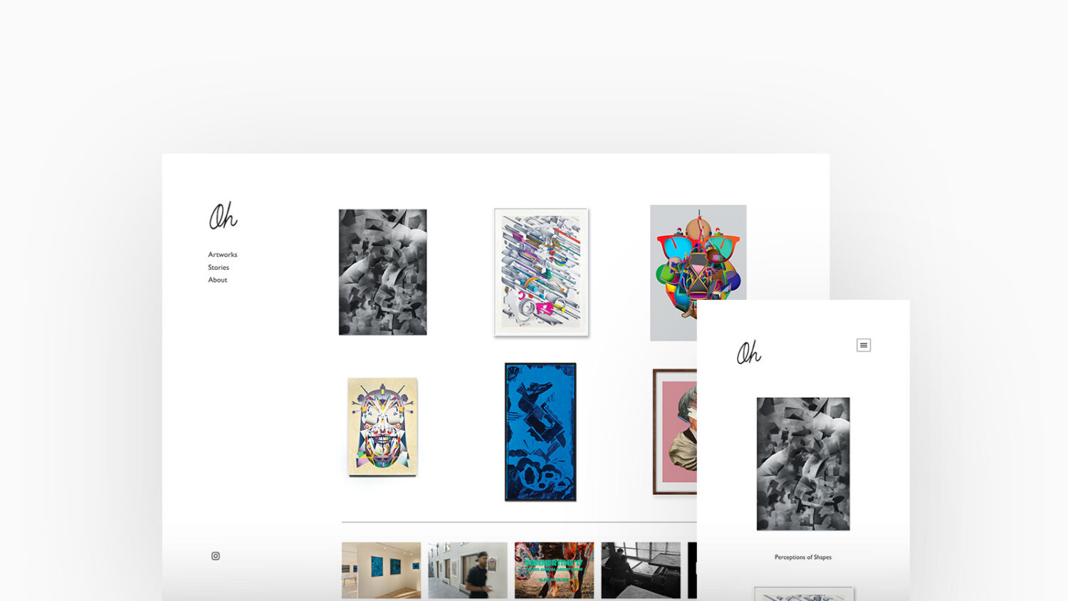
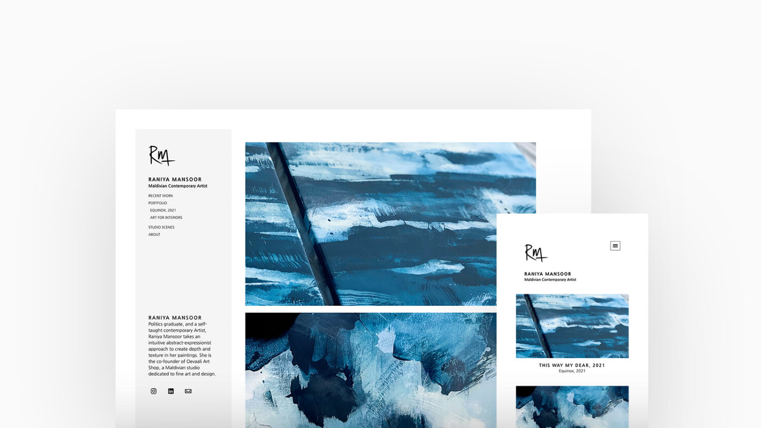
Raniya Mansoor (Theme: Canvas)
A self-taught Maldivian painter whose abstract pieces draw from her island roots. Raniya uses Canvas with a stacked homepage and strip layout.
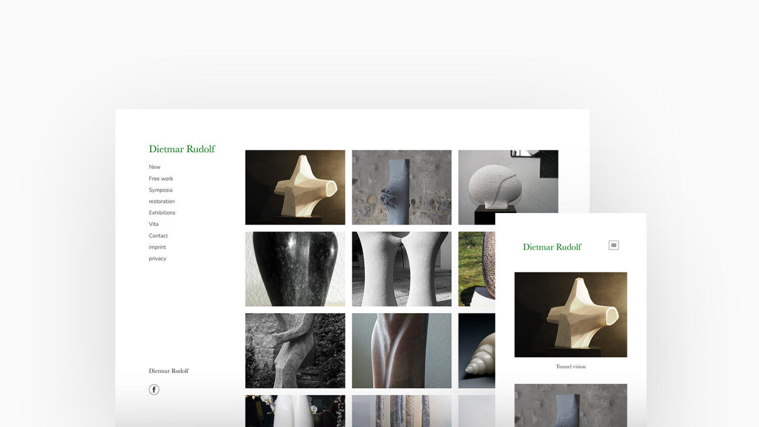
Dietmar Rudolf (Theme: Canvas)
A German sculptor specializing in minimal stone installations and restorations. Dietmar uses Canvas with a thumbnail homepage and lightbox gallery.
How to Apply These Portfolio Insights to Your Own Website
Whether you paint, sculpt, or run a filmmaker portfolio platform, these online portfolio design trends keep your site functional and client-focused:
- Let the Art Provide the Color: Most artists stick to a plain white background with dark grey or black text. It keeps the focus on the media and avoids color clashes.
- Never Crop Original Aspect Ratios: Use responsive layouts that display full horizontal or vertical frames so your compositions stay intact.
- Keep Your Menu Lean: Stick to 3 core tabs (Work, About, Contact). Don’t make people dig through sub-menus to see your work or send an email.
- Make It Load Fast on Phones: Test your page on mobile screens to make sure images load without shifting or lagging.
Fabrik lets you document your creative work and launch a responsive site in minutes without dealing with code. Check out our dedicated Artists Portfolio Builder to start your build.